Sunday 25 October 2020

Opposites attract


Autumn v Spring


Red and green...

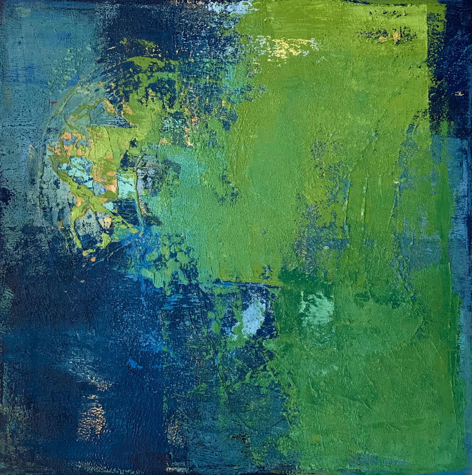
The opposites on the colour wheel
are complementary.


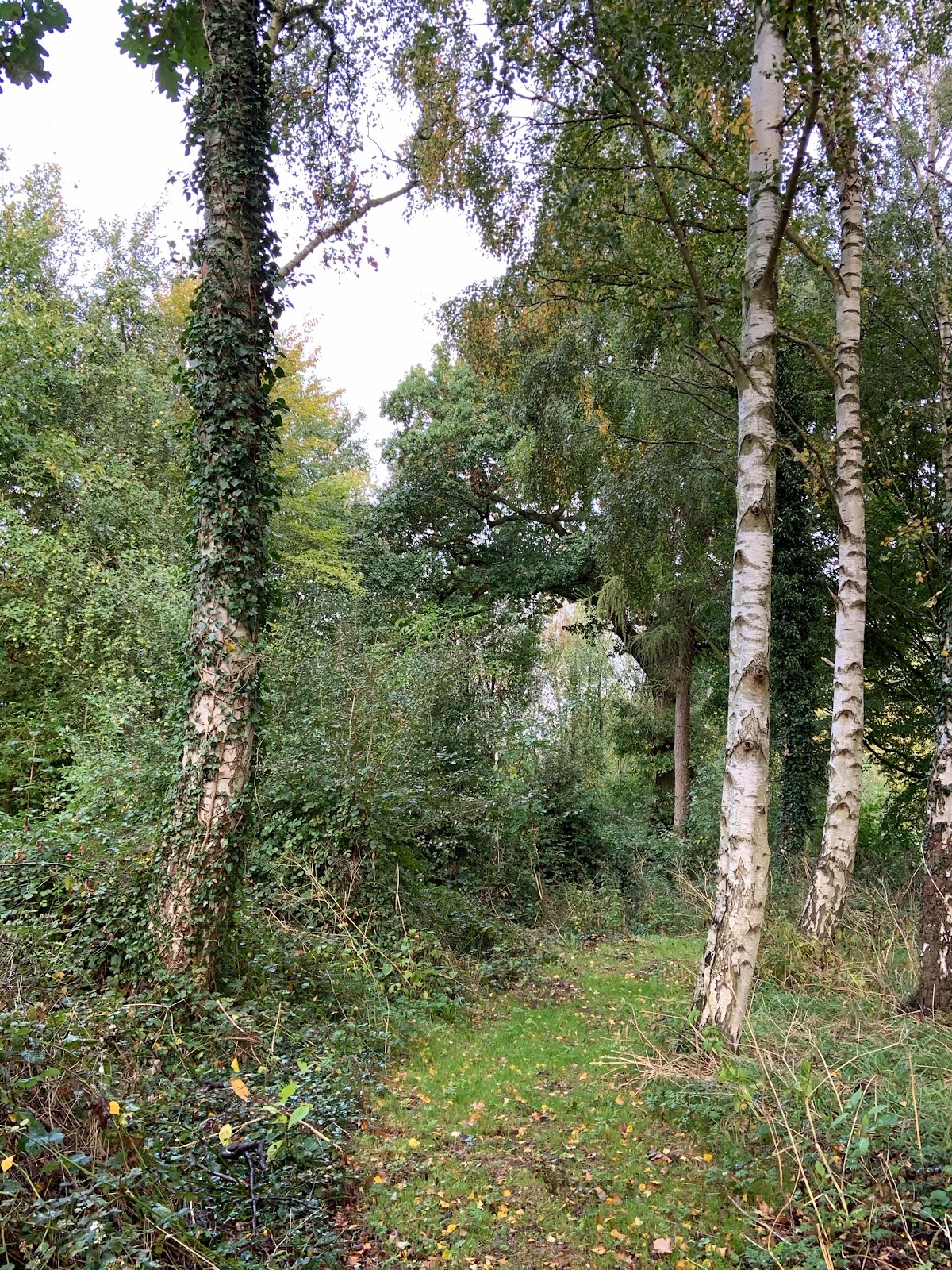
Both colours are around me in my garden and farmland.
Bright spring green is a carpet of new sown crops
whilst reds in berries and leaves are the autumn curtains.


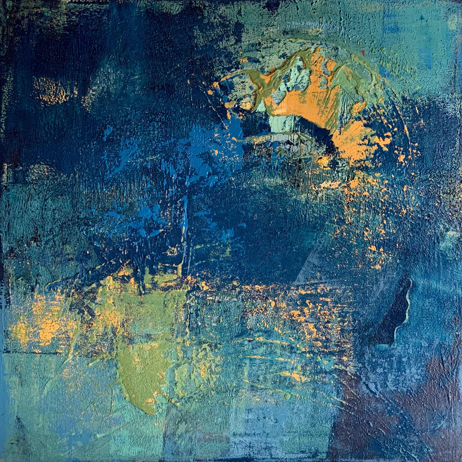
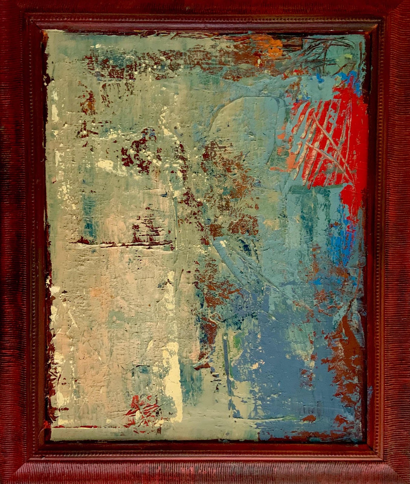
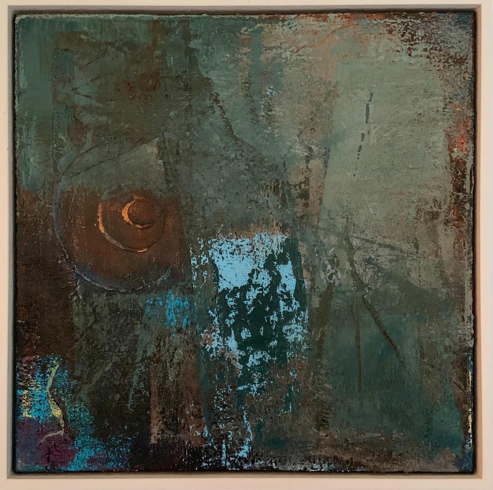
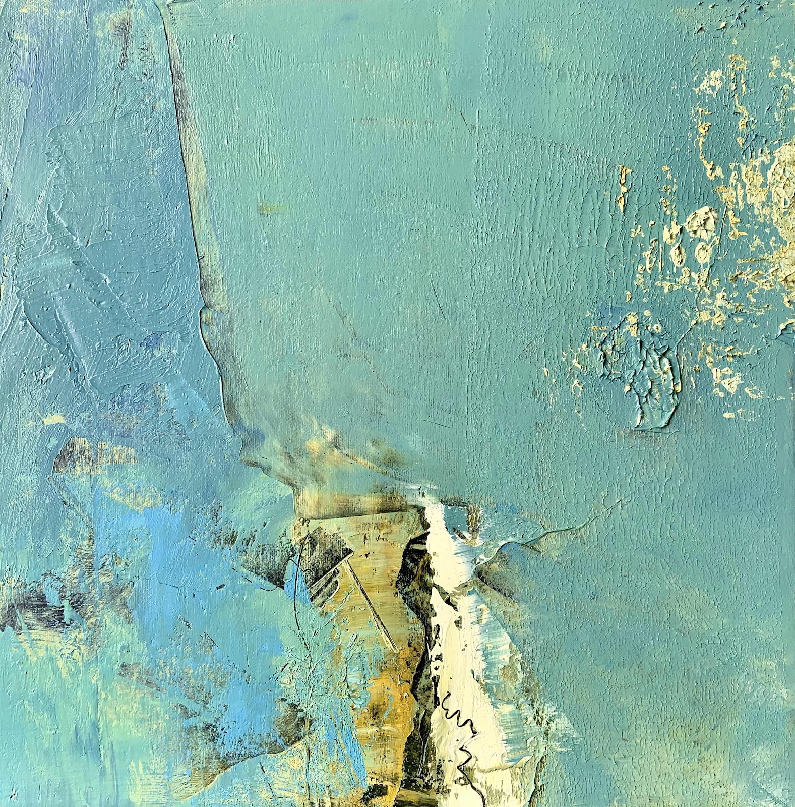
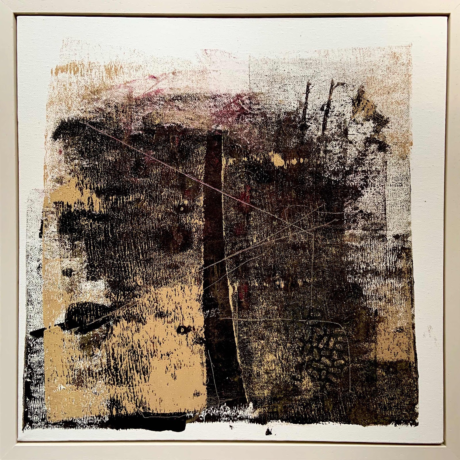
The painting began quite differently...
it was mainly blue and a splash of yellow.


This didn't last long however,
as I wanted to remove the yellow.

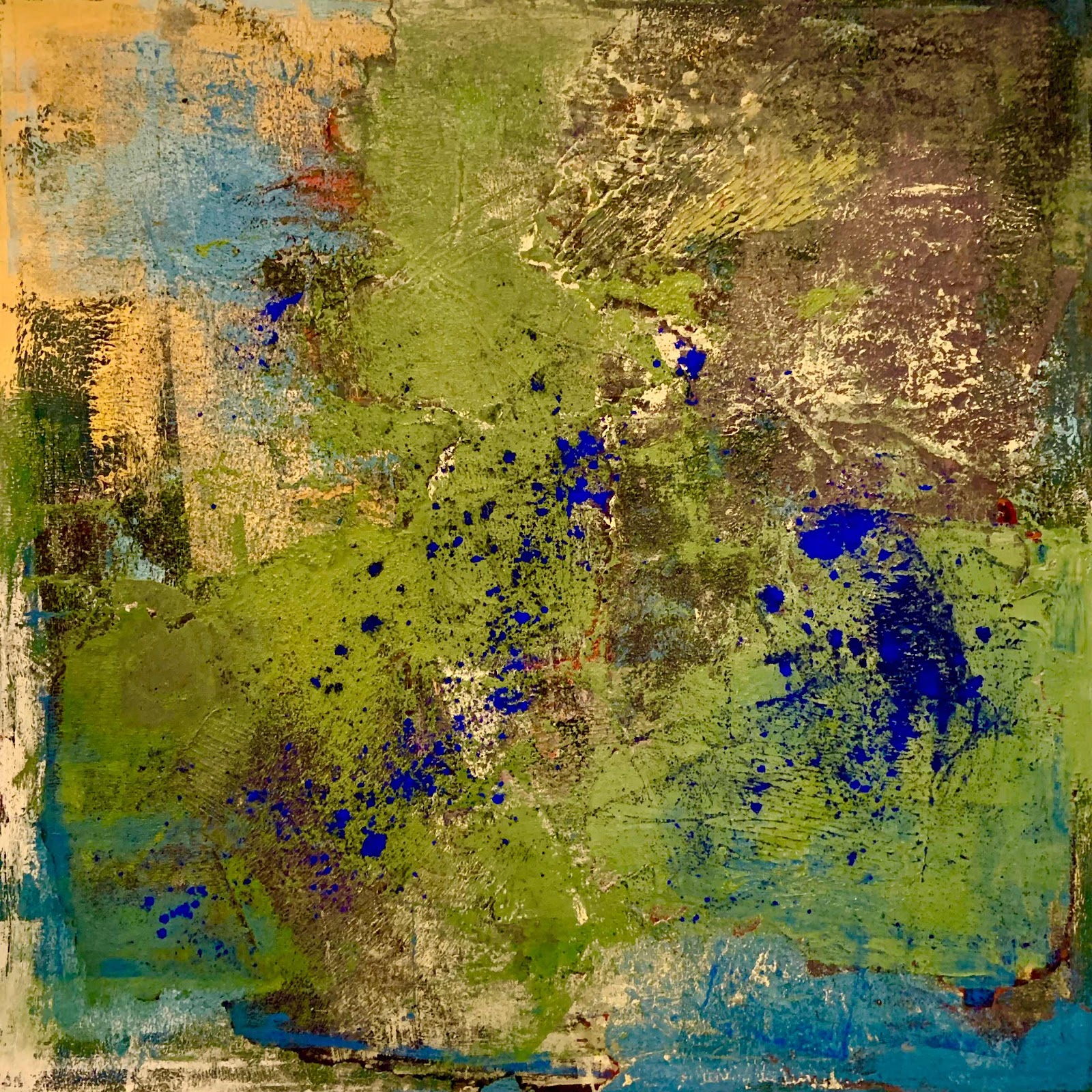
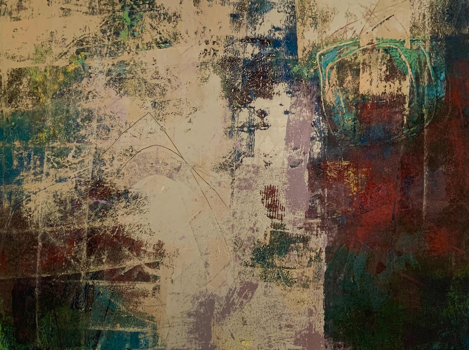
Deciding green was the best way to go
I mixed a pile of paint.


That got the yellow out of the way.

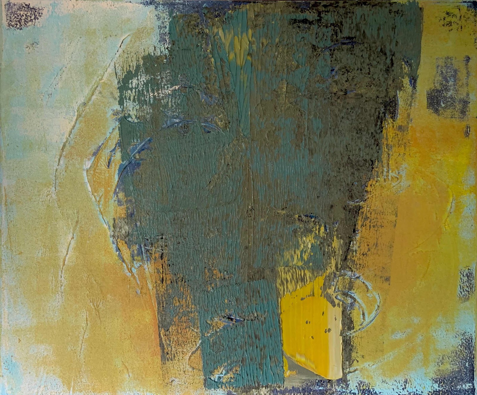
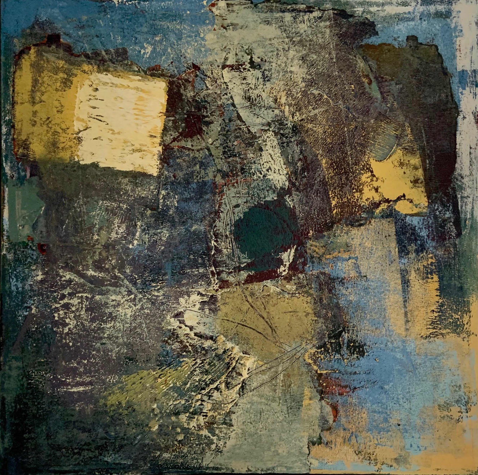
I could have stopped there but after that it all got ugly
as the painting was overworked and going rapidly downhill.
Time to leave it.


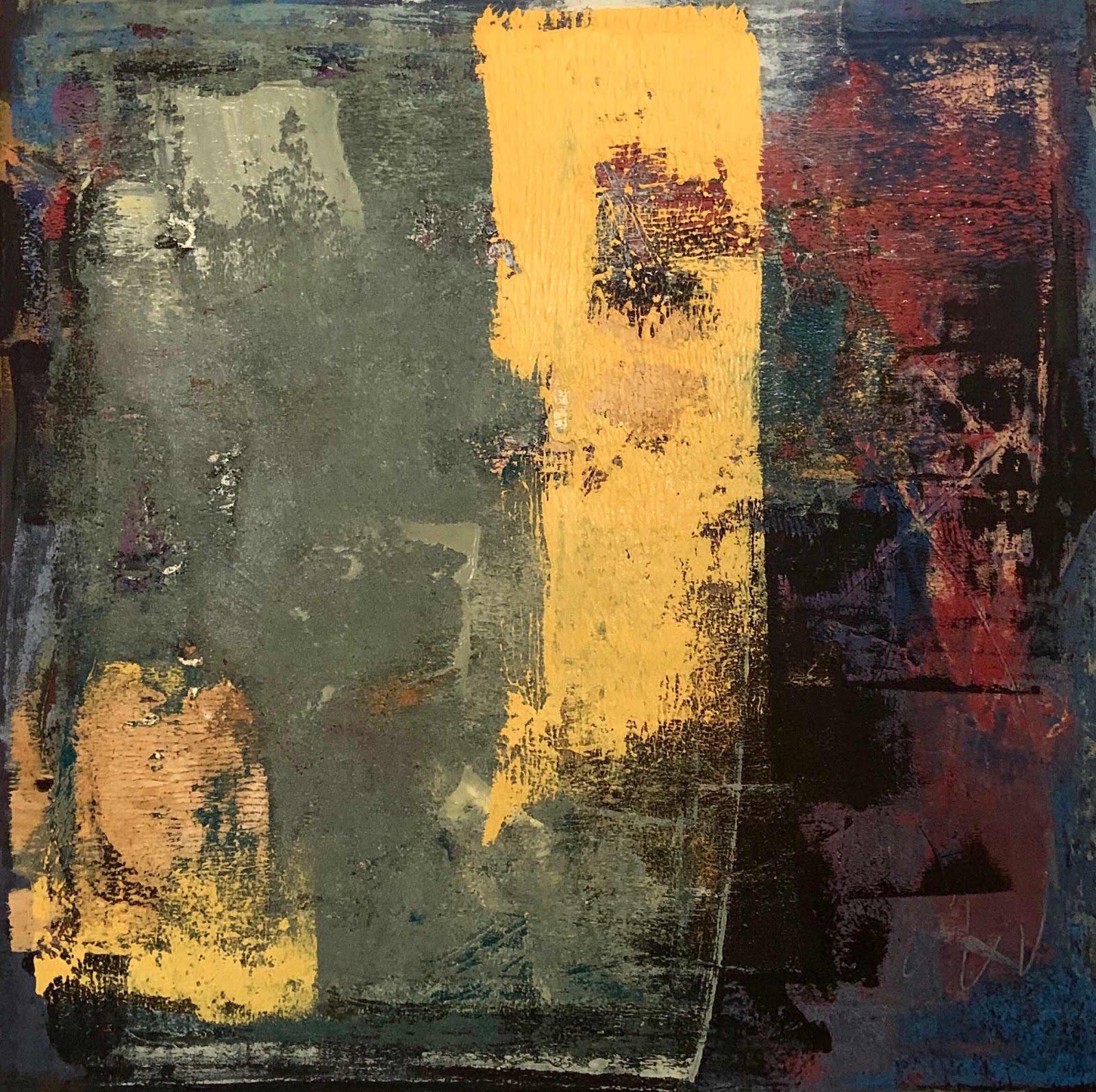
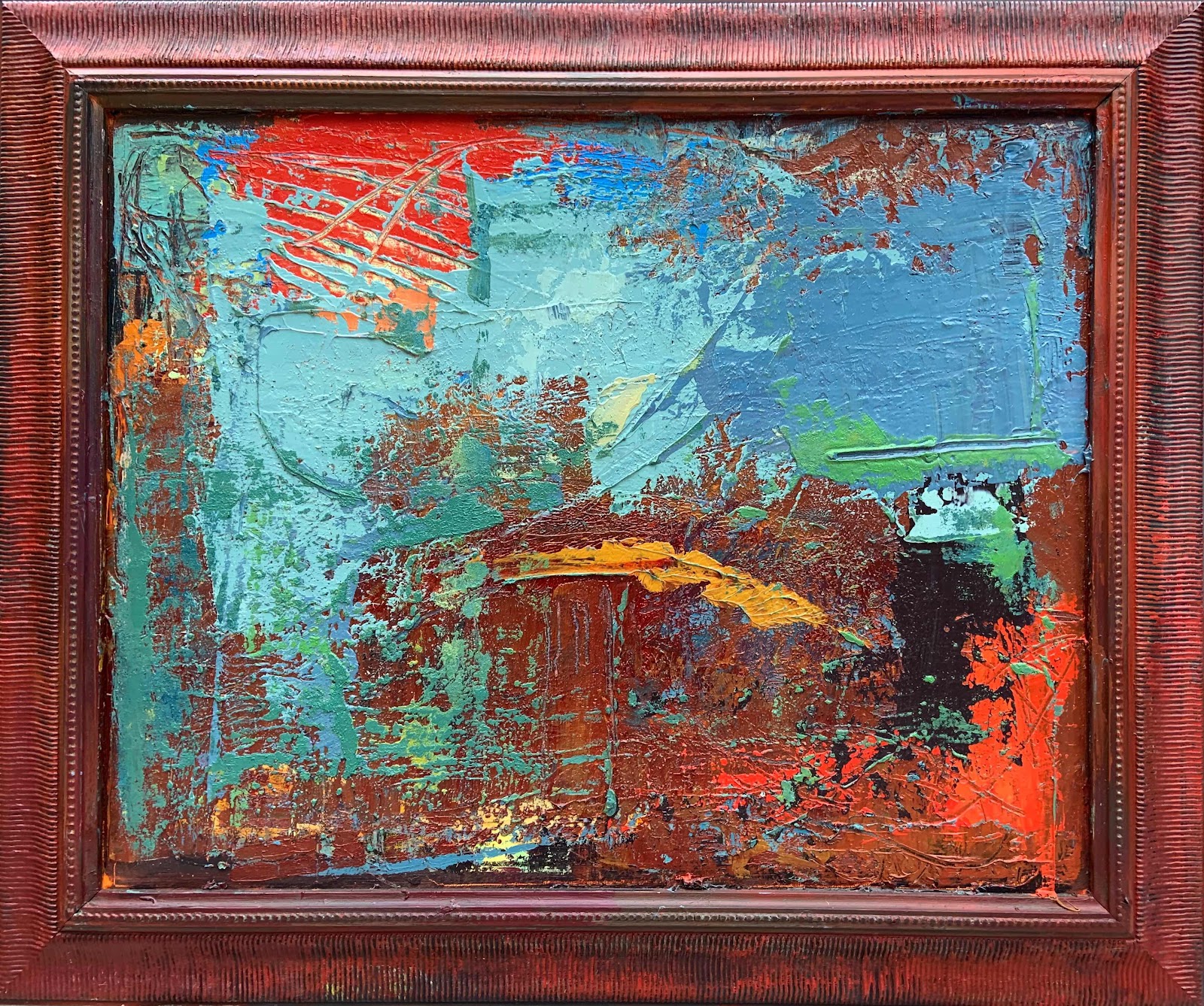
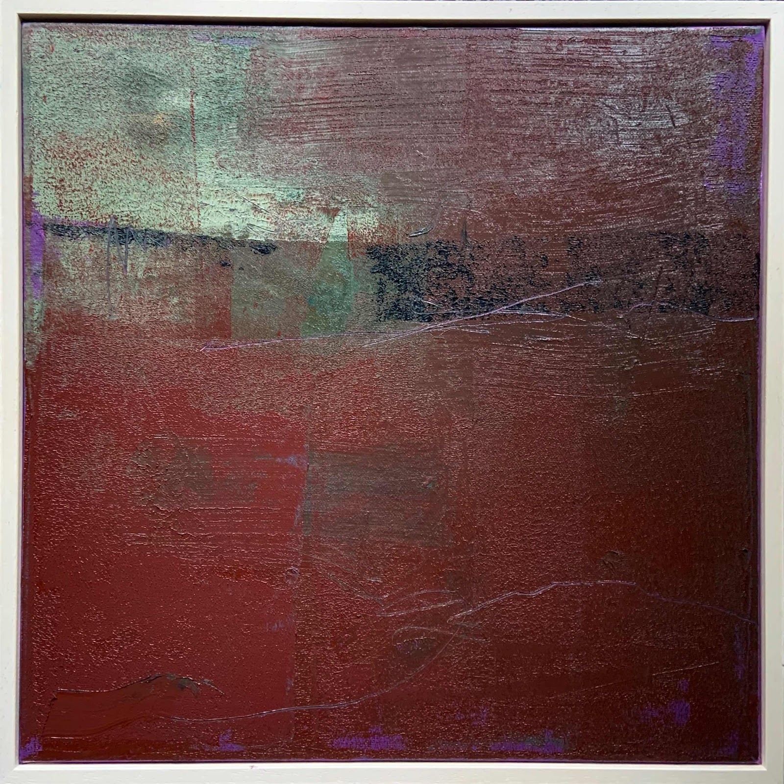
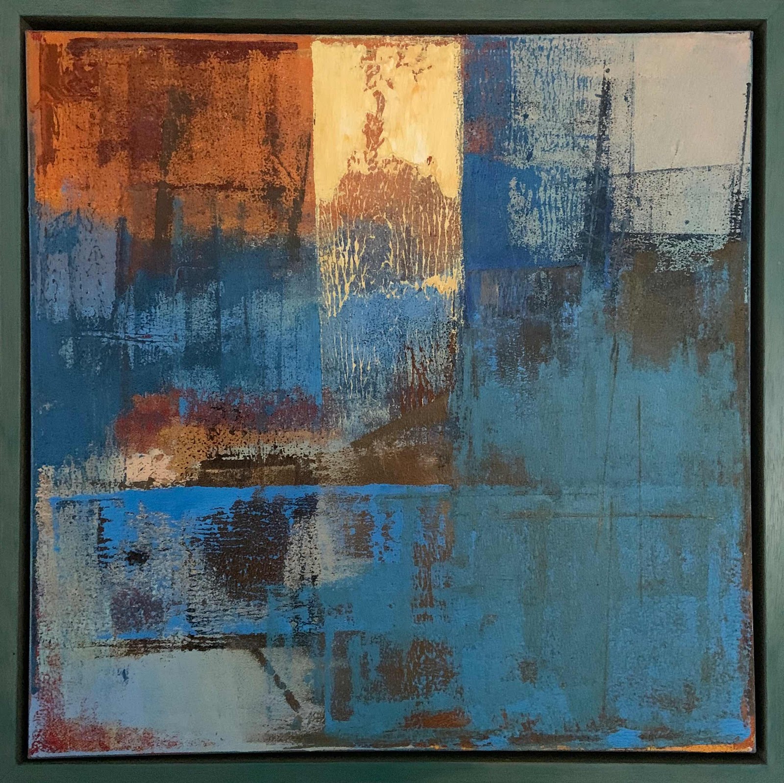
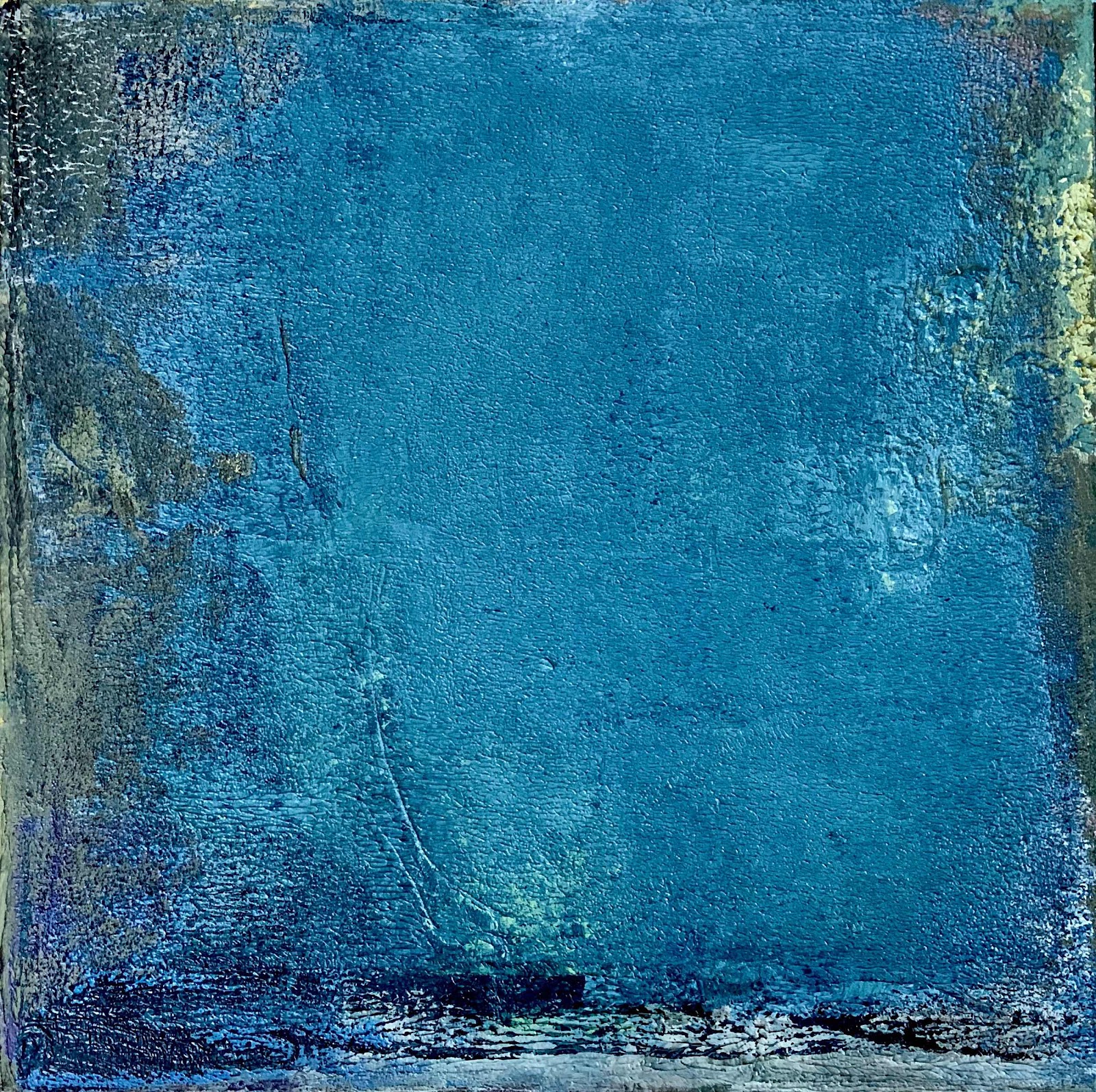
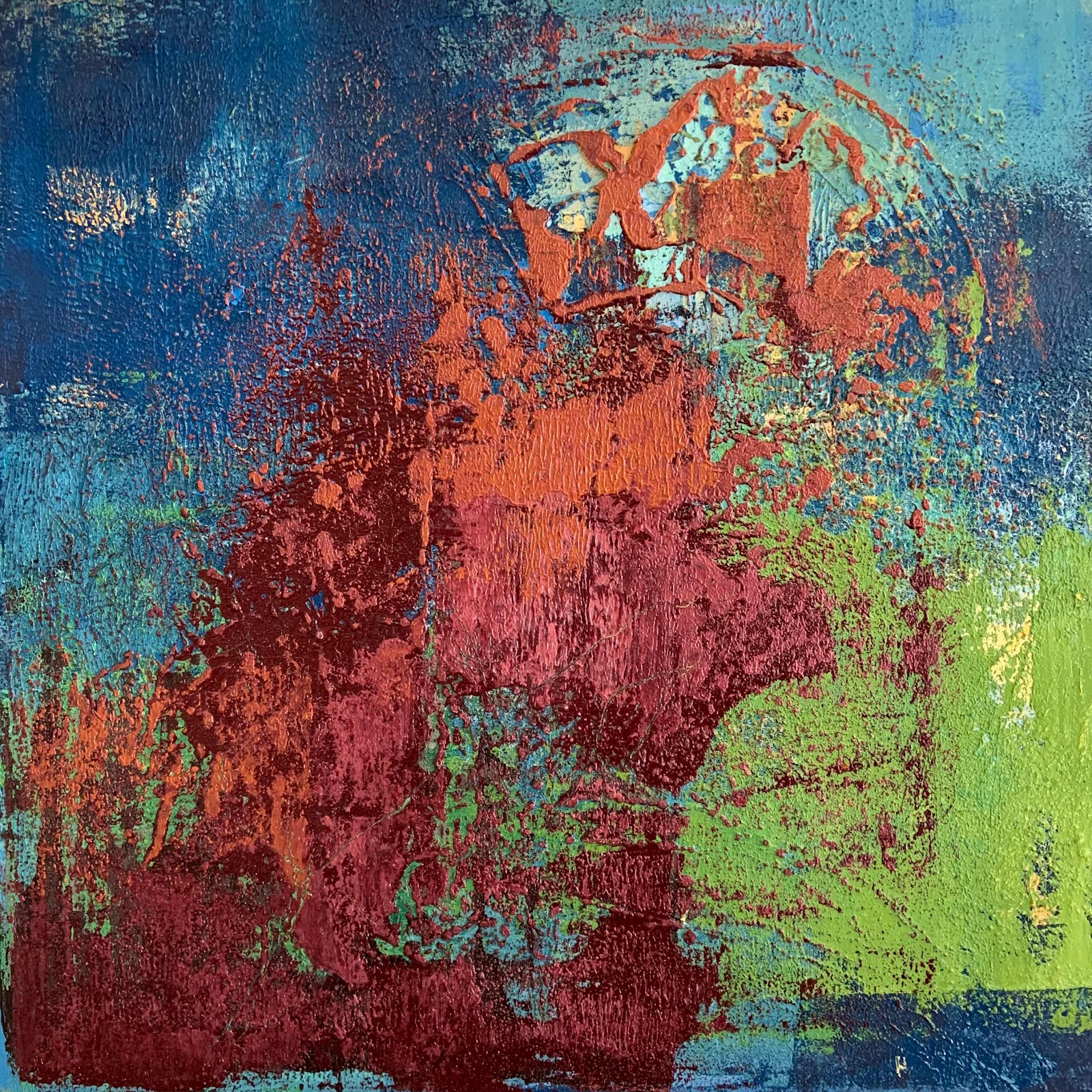
Next day I must have been inspired by
the sun on all the autumn finery.

It was time to go red.
Enough of the green.

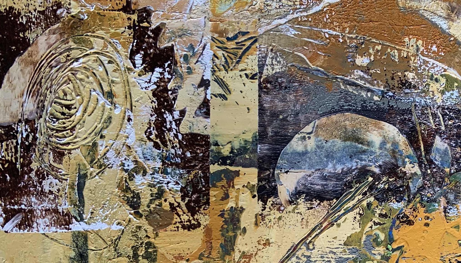
The canvas was turned round and layers
of reds were rolled on with a brayer.

Some green was left to remind me of the fields.


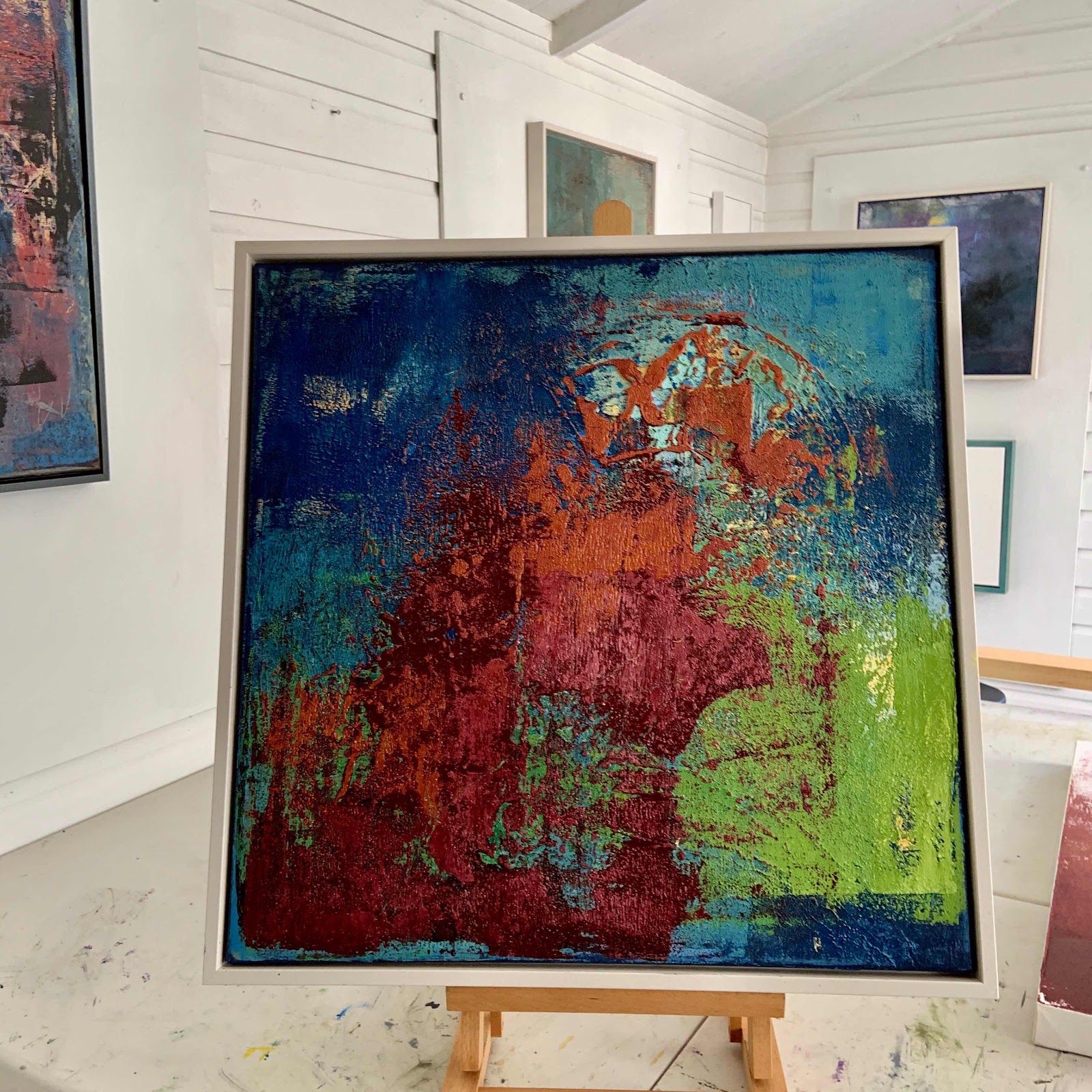
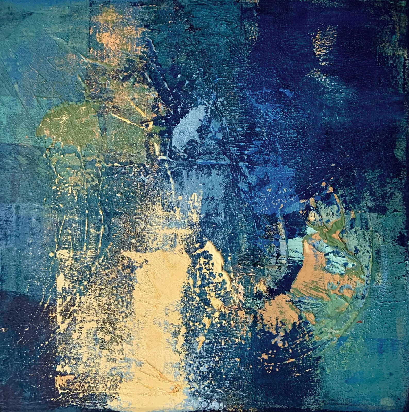
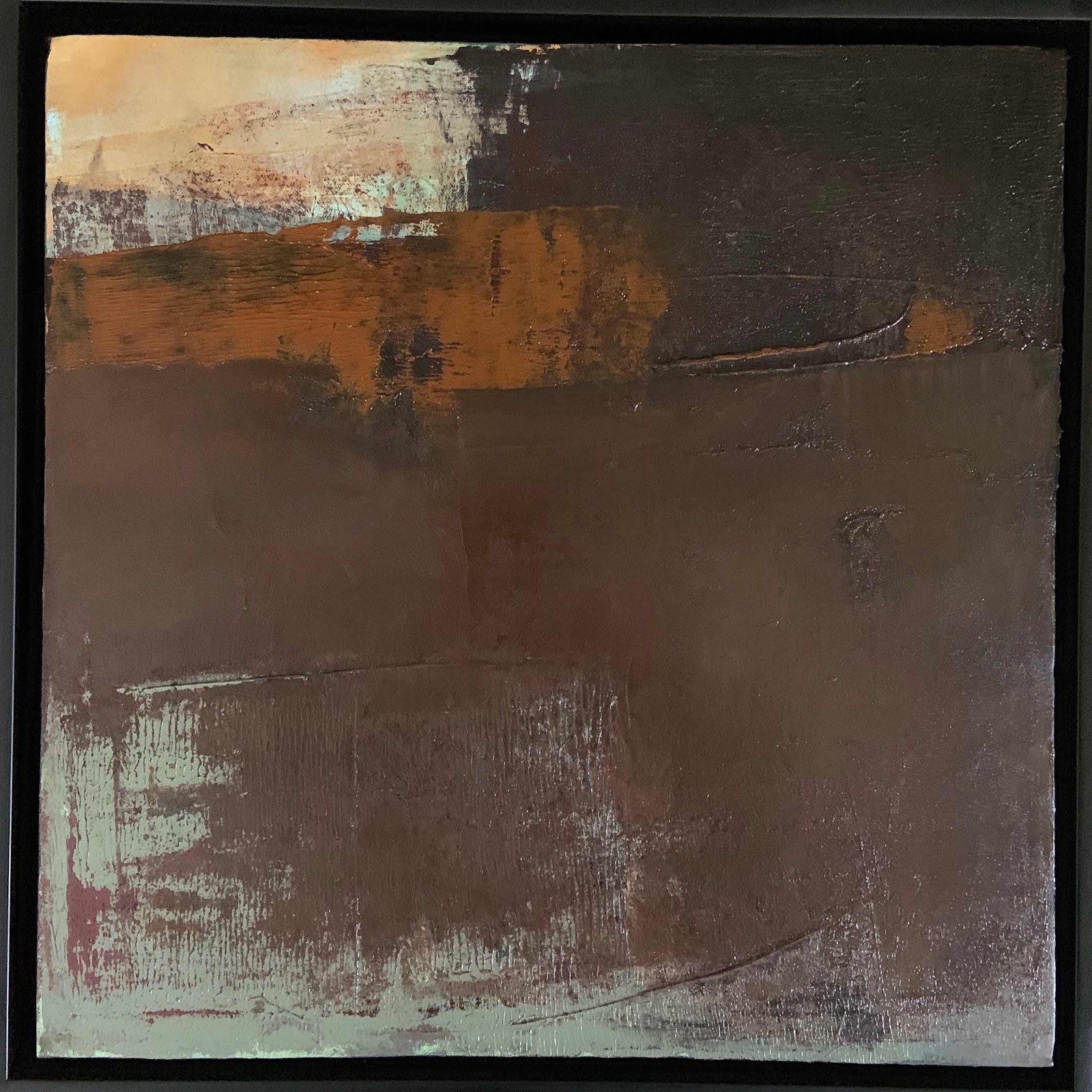
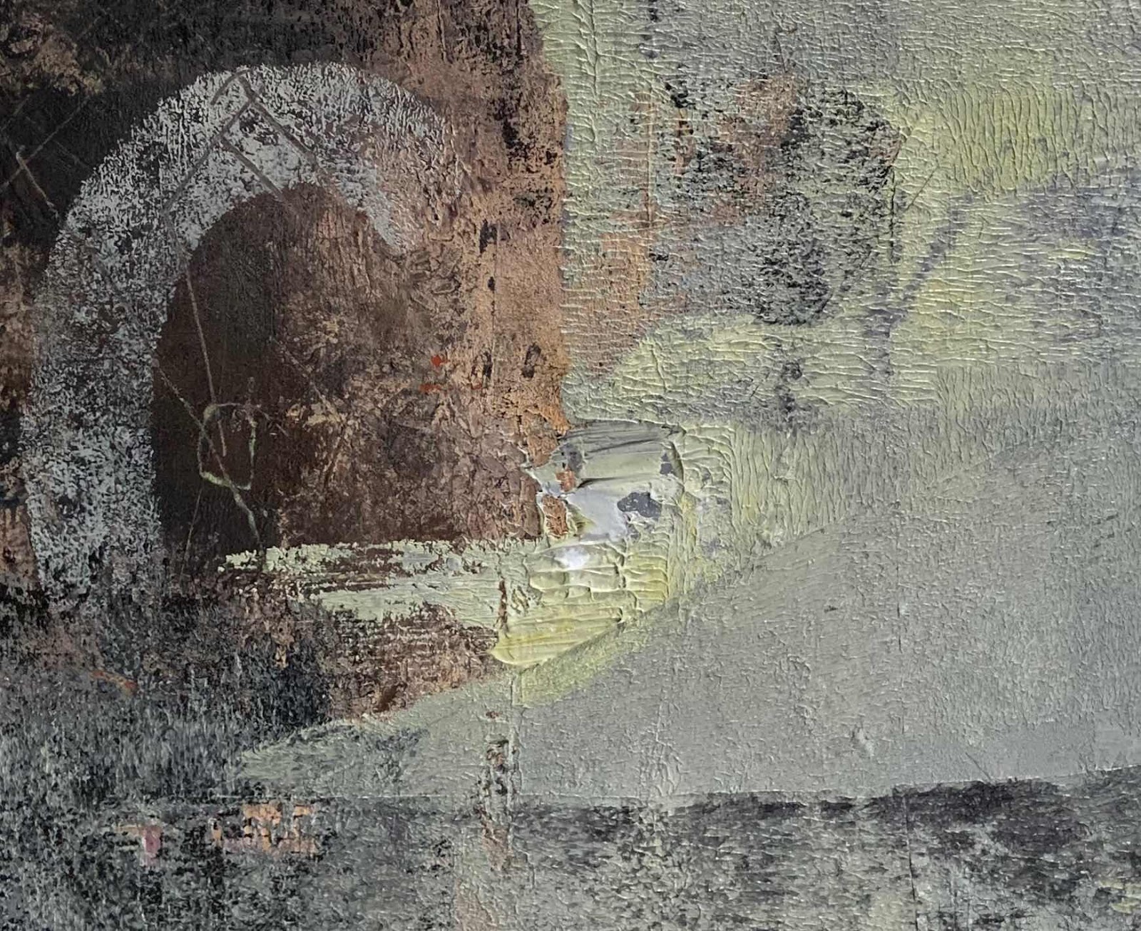
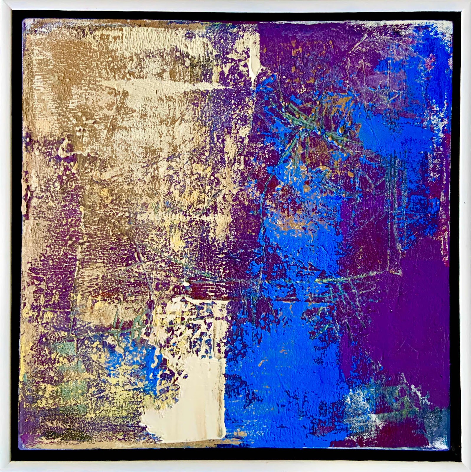
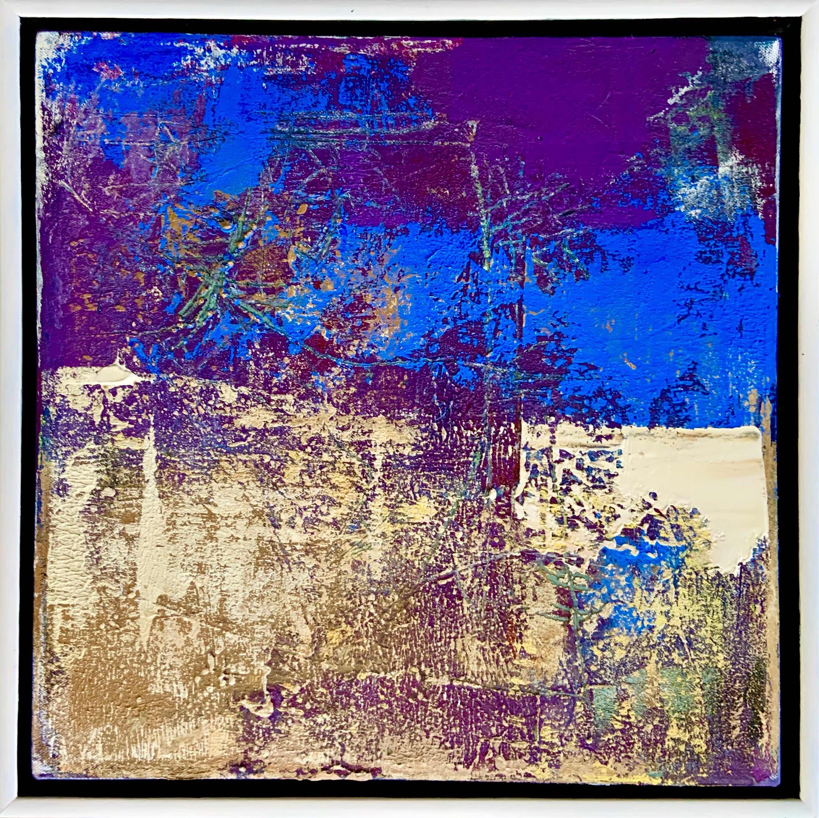
Here is the painting drying on the table.
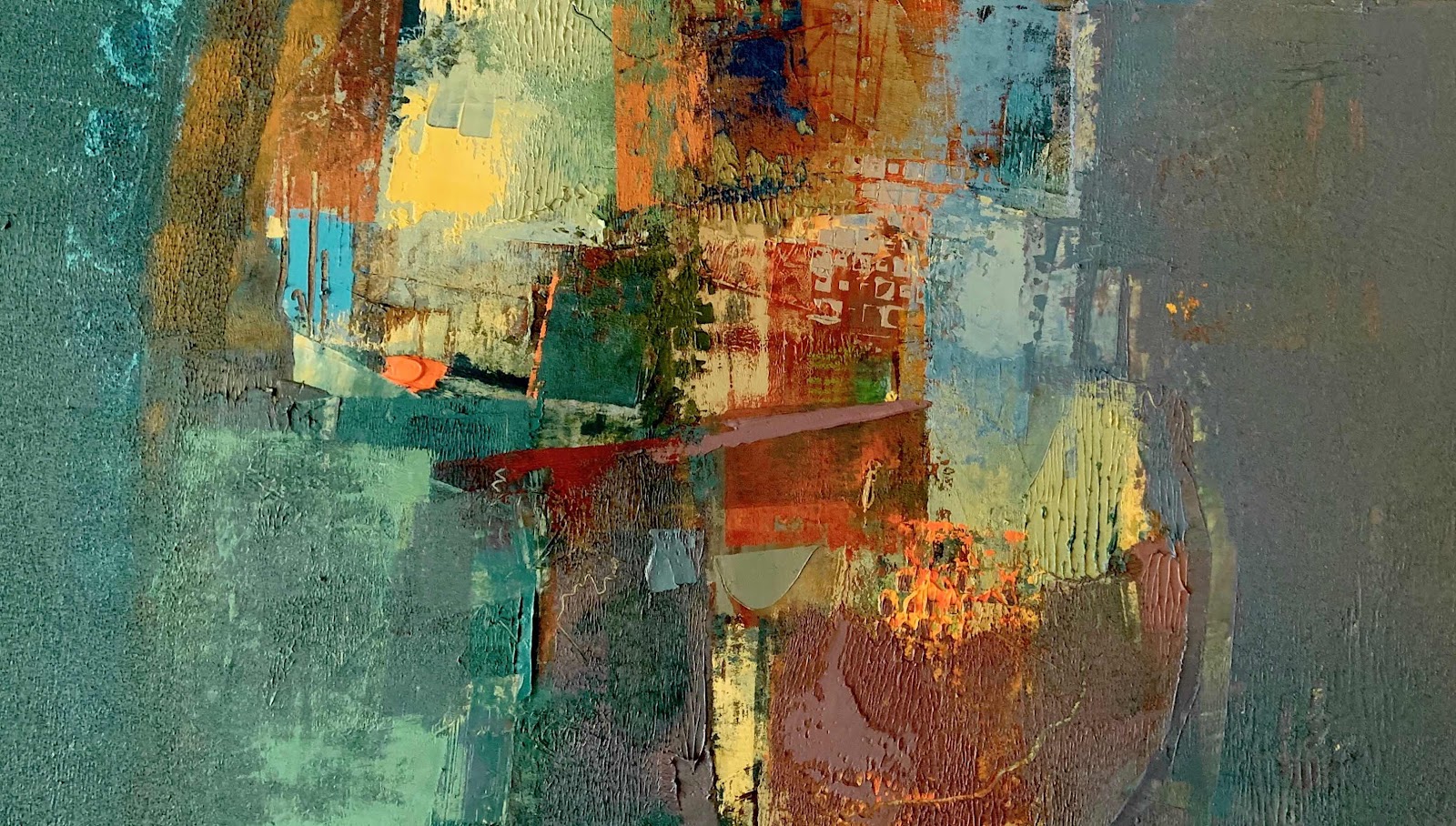


'Autumn on my mind'

Oils and cold wax medium on 24 x 24 inch canvas 


Thank you for visiting...


Changing places


Autumn clear out...


This has now gone and morphed into the one below
which is more restrained, softer and kinder to the eye.


'Rising from verdant green'

Oils and cold wax medium on 30 x 30 inch canvas 


For me, choosing a painting to fit a particular place
can be difficult.  It has to be the right size,
fit in with other things around it and 
generally not cause too much trouble.

Maybe I am too rigid in my thinking
but harmony in my paintings extends to
harmony in my surroundings.


Green.


All the fields around my home are turning green.
A bright young green which contrasts with the
reds and golds of autumn leaves.


Is this why I am reaching for these colours in my palette?
it's not really intentional but I do wonder.

This one was reworked yesterday...


Oils and cold wax medium on 24 x 30 inch canvas.


A smaller piece, 16 x 16 inches
using the leftover colours on my palette.


It is drying before any further decisions...


Autumn at the studio doorway...
Ferns and grasses with a coppiced wood chair.


The sun is shining, all is bright and beautiful.


Until next time,
thank you for visiting.


Tuesday 20 October 2020

Sun's out again


....and wearing a hat!


'Dawn chorus'


I knew it wouldn't be long before some
'bright' appeared in my work.

However, I did mix a lot of paint so
several paintings got a coating.


'Beyond reality'


This piece has been in the studio for a while.
I thought it was finished...but


(The previous picture)

I turned it round and decided to work on it.

It's surprising how a few changes can
make a difference.


Now for a larger one...


'Rising from verdant green'


This painting can be viewed in four ways.
It is balanced.

That is something I aim for.
and this time it worked.


Just to give you an idea...


To finish


Here is a painting which was in my home.
I thought I would never change it but this happens often.


I turned it to vertical format
and scraped off any raised parts.

A coat of greyed down green on the left softened the image,
and a little leftover cream paint rolled over added simple highlights.

It is quieter now and will be added
to my 'restrained' collection.


'In the softest way'


Thank you for visiting...
Until next time


www.wildartdesigns.com

Thursday 15 October 2020

Keeping calm


And definitely carrying on.


'Red mist rising'


Since my last post I have been thinking...
there is a lot to be said for being calm and restrained.


My touch of restraint has moved on to an 
exciting new group of paintings.


'October'


I have had an enormous cull in the studio.
No paintings have been scrapped,
just put in a corner facing the wall!

I may well return to them and rework parts.

My website has been updated too.


'Another time, another place'


This painting has been on a very long journey.
I dare not show the previous images but 
take my word for it...

For now it will hang with the others as part
of the new series.


'A glimmer of hope'


The last time this was on an outing it was
in Sam Scorer Gallery, Lincoln in the Nadin Show.

As soon as I brought it home I knew it had to change.
This is the new image.
I like it a lot.


'The last time I saw this place'


Oh my...this one has had a revamp for the third time.
It has a calmer feeling and joins the others in the group.


Here is an old-timer.
It's been moved to a more prominent position.
Loose and relaxed, with a hint of mystery.


'Twilight fades the blue'


This painting has a touch of chaos...
and hangs on a wall in my home.

It won't join the studio group but will stay for now,
until I decide whether to give it a makeover. 


'Glimpses of Chaos'


So there it is.
Some day I shall open my studio again for visitors.
In the meantime I shall continue to ramble along here.

I hope you keep me company.
Thank you for visiting.


Here is our wild garden where I walk with
my whippet boy Brodie.


Click on the link to see my website 

Thursday 8 October 2020

Feeling blue...


What is blue?


Blue is a sapphire sky, 

On a hot summer's day, 


Blue is the ocean, 

Deep and crystal clear, 


Blue is a forget me not, 

Blowing in the wind.


(Unknown source)


I could stop there but there is always another story.

My blue painting has been reworked several times...


Here is the painting before I began.

I wanted to calm the image.


It might seem easy but it has taken three days of struggle.


There was a lot of scraping back 

and rubbing down as I tried to get what I wanted.


Actually, I wasn't sure what I wanted.

I thought I should include some strong marks,

and maybe some additional colour.


Resisting the urge to add, instead I subtracted.

This has given my picture space to 'breathe'.


It's a calm place to be.


'Deep in thought'


Oils and cold wax medium on 16 x 16 inch canvas.


Thank you for visiting...

Until next time.


www.wildartdesigns.com


Sunday 4 October 2020

Restraint


Is restraint good?


A viewer recently said he liked 
my more restrained paintings.  

Before I go full speed into 
making more of these...

I shall be careful.
This is only one person's point of view.  

Another viewer could prefer a lively picture.  
We all have our preferences.

This is what makes art so exciting.


This picture is a similar palette but quite busy.  
It is a 'virtual' crop of a larger piece.


Taking a personal route...


I paint for my own enjoyment 
and try not to be too influenced by comments.
It is an easy trap which can stifle one's imagination.


This painting can be viewed 4 ways.  
This aspect focuses on marks and contrast.

If it is rotated...
the image is suggesting a landscape.  


Two ways of viewing.

'Differing Views'

Oils and cold wax medium on 16x16 inch canvas 


Back to a restrained palette...
Another re-worked painting this week.  

'Parting ways'

Oils and cold wax medium on 16x16 inch canvas 


Finally...the full picture.

I might title it 'Restraint'

Oils and cold wax medium on 24x24 inch canvas 


I shall leave my thoughts here
for you to ponder.

There may be more restrained paintings to follow.  

Until next time,
thank you for visiting.