Friday 22 January 2021

Do it anyway.


What the eye sees.

It is a natural thing to look for something 
we recognise in a painting.
Particularly in abstract art.

I have had viewers looking for 'things'
in my paintings and then tell me what they see.

I have learned to cope with this
but sometimes I will change the work if I am 
not happy with the comments.


Recently I have been trying to avoid
reality in my paintings, preferring to keep
the image as pure abstract.

This is not easy unless using geometric shapes.
Organic shapes can easily 'morph' into 
something resembling the natural world.

Does this really matter?
Do I do it anyway?
Who cares?

I care.

I paint for my pleasure but if that
pleasure becomes a nightmare,
what then?


Rather than drive myself crazy over my dilemma,
I shall aim for my goal but not despair if I cannot reach it.


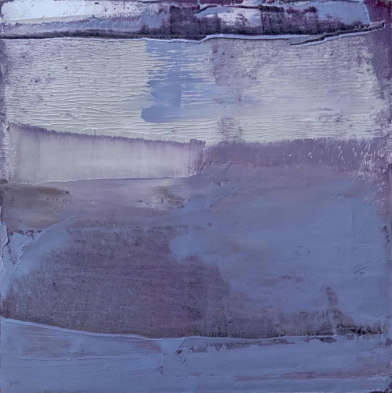
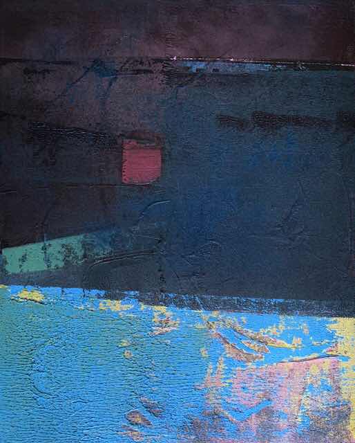
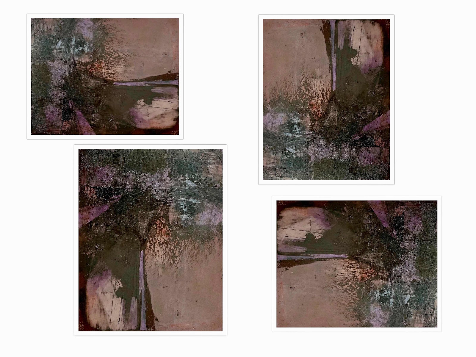
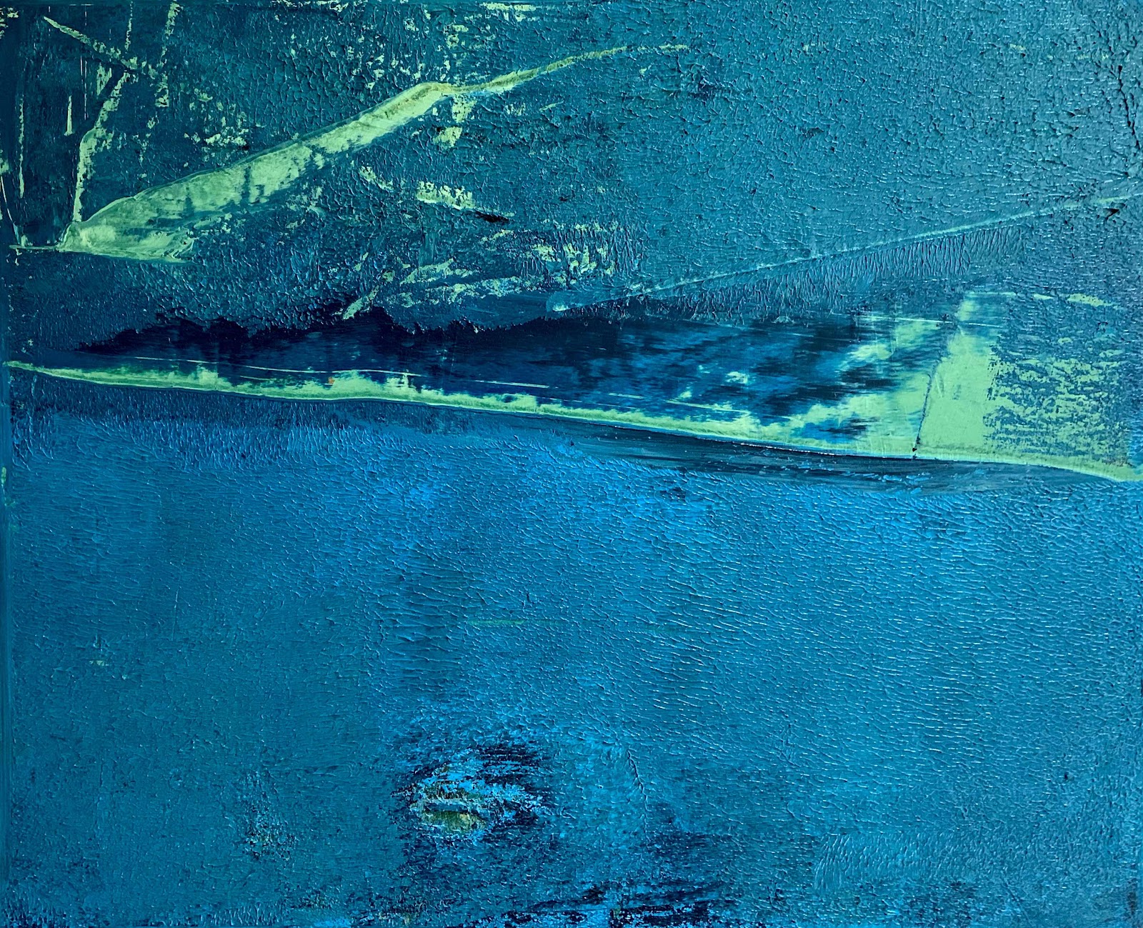
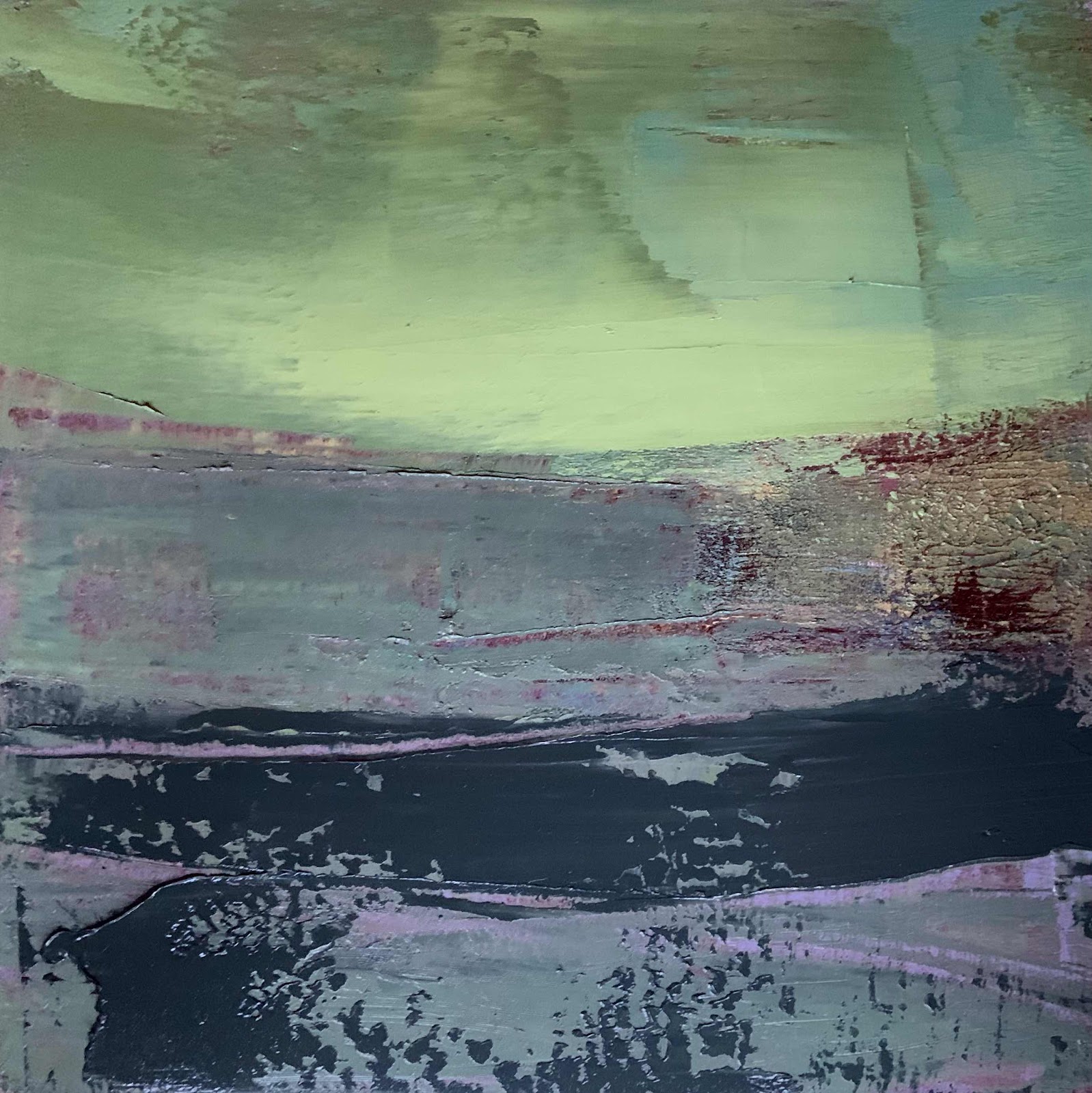
Here is another way of seeing...
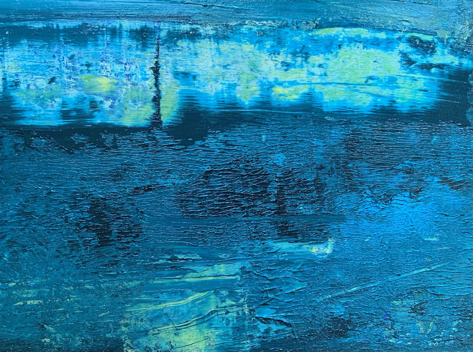
Flip the picture upside down.

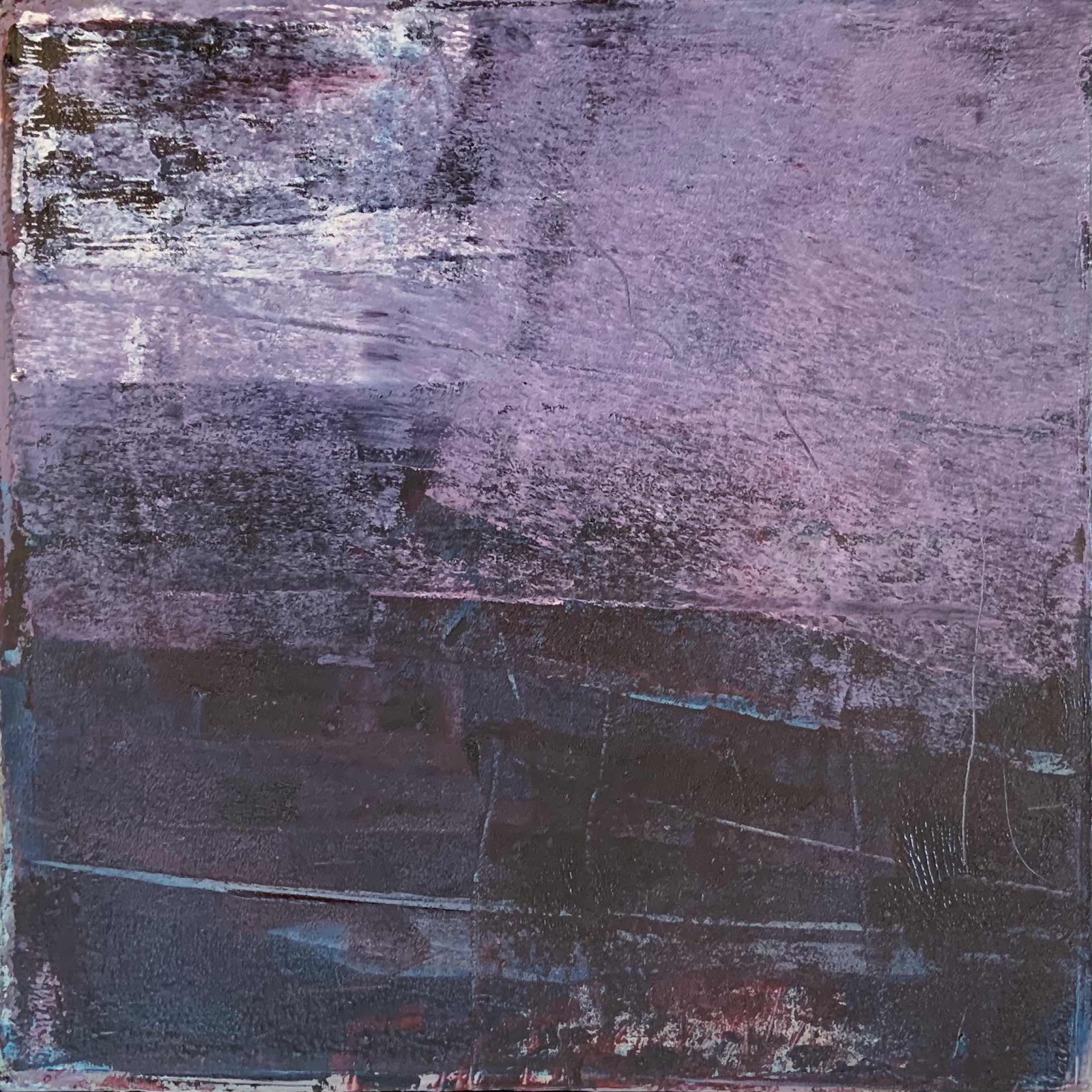
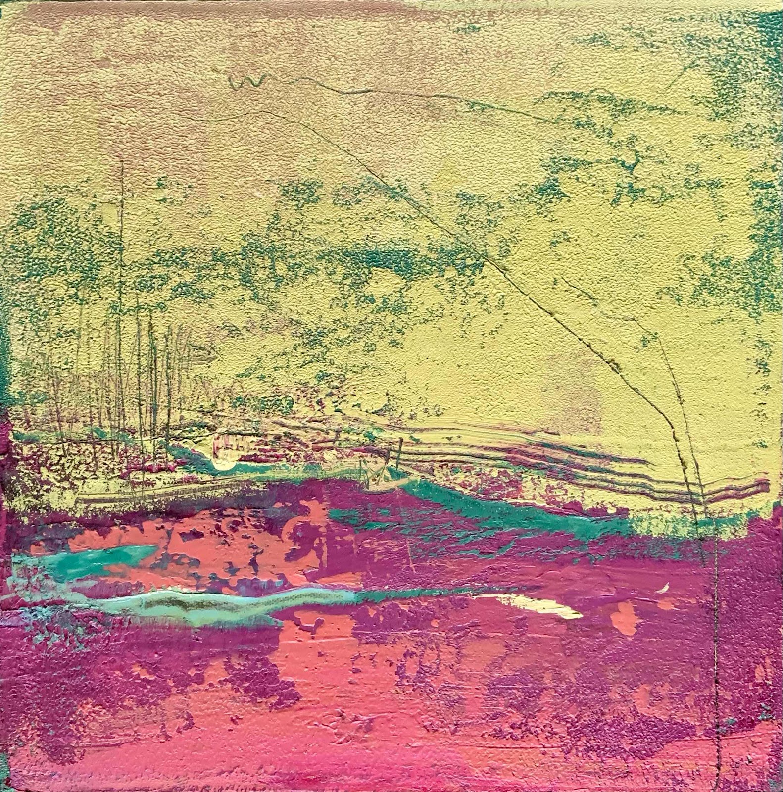
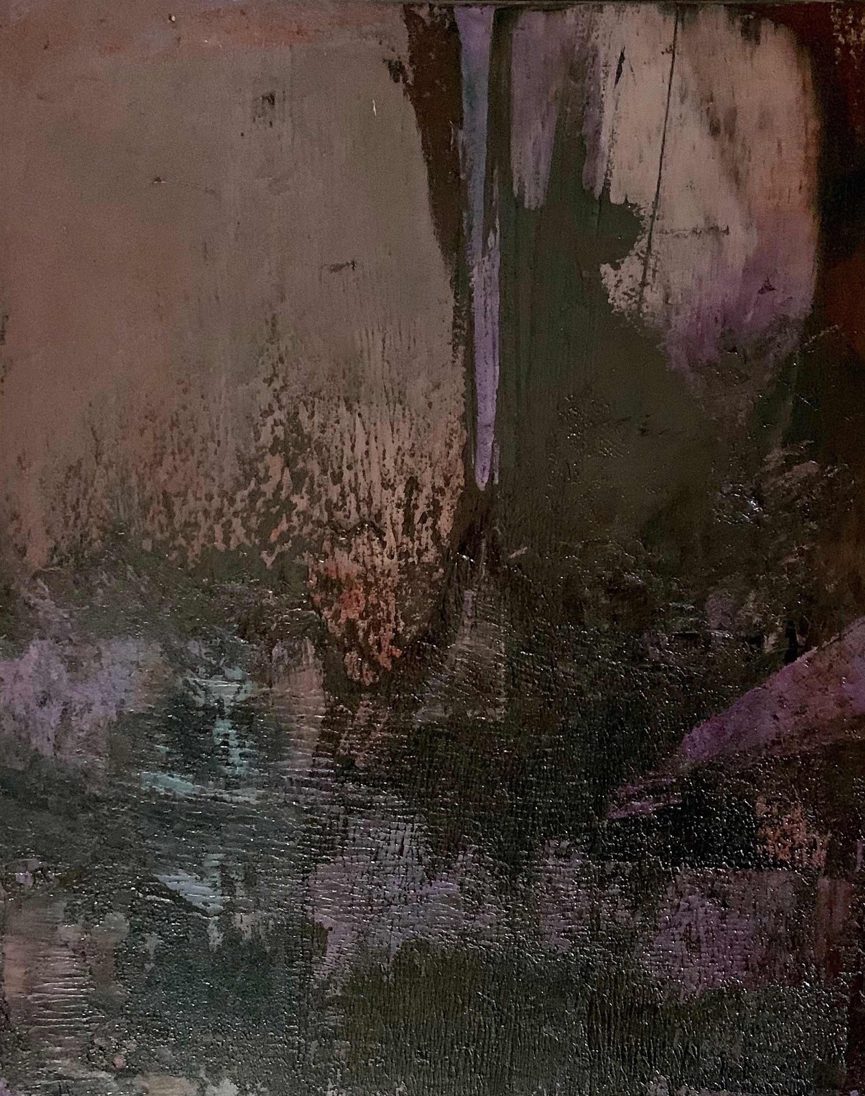
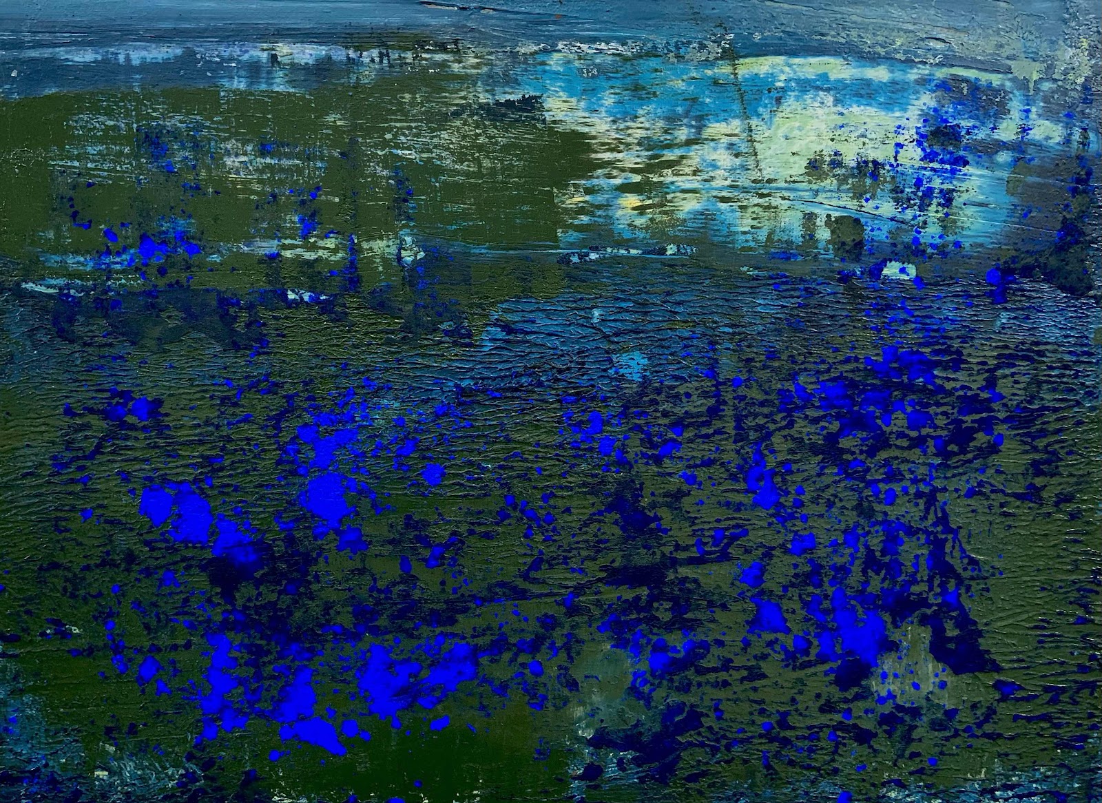
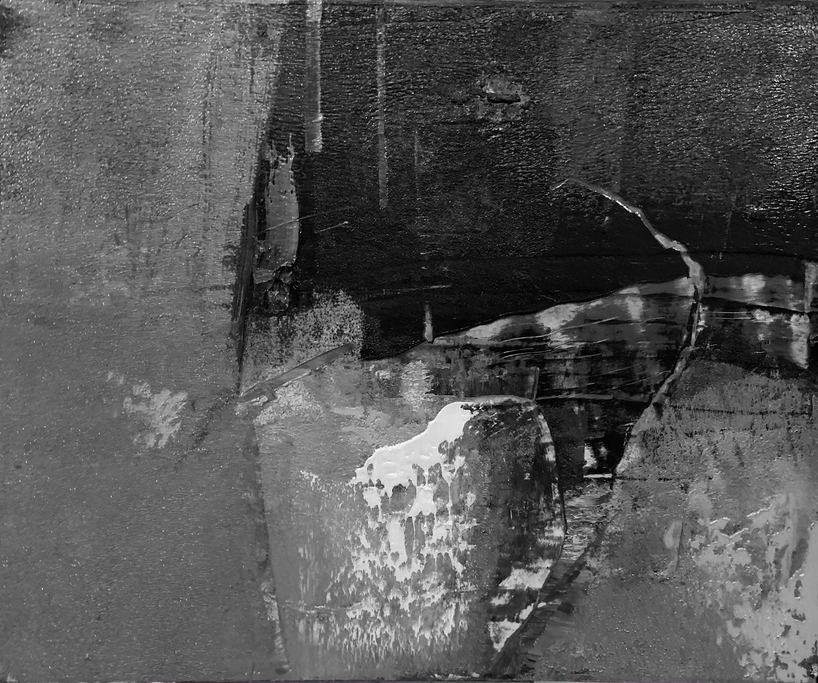
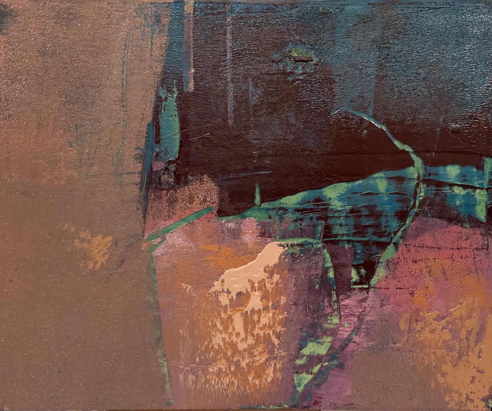
A new painting drying on my table.

I am liking the shapes, colour harmony and the 
contrast between dark and light.

There is texture and evidence of the layering
where I have scraped back the paint.
It tells a story.


Others might think...landscape 😊
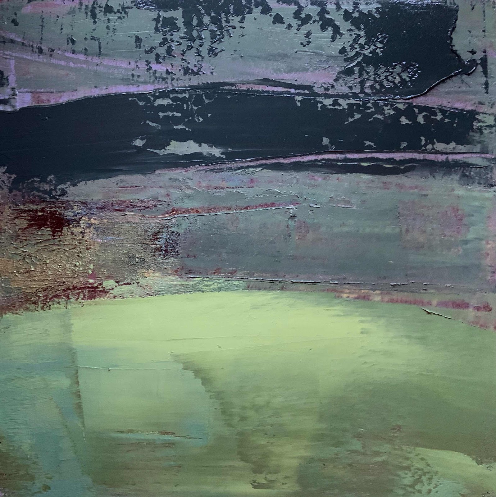
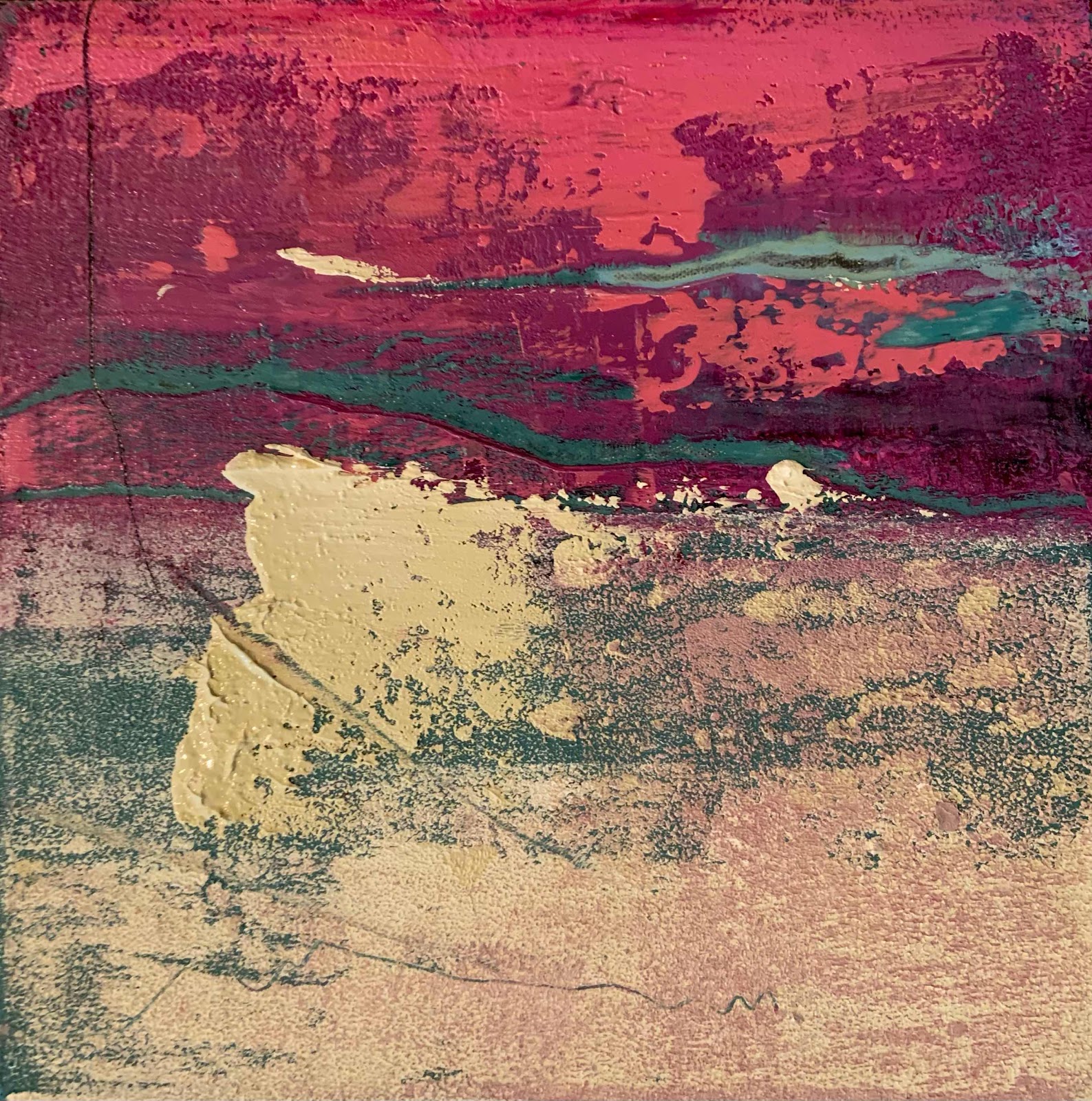
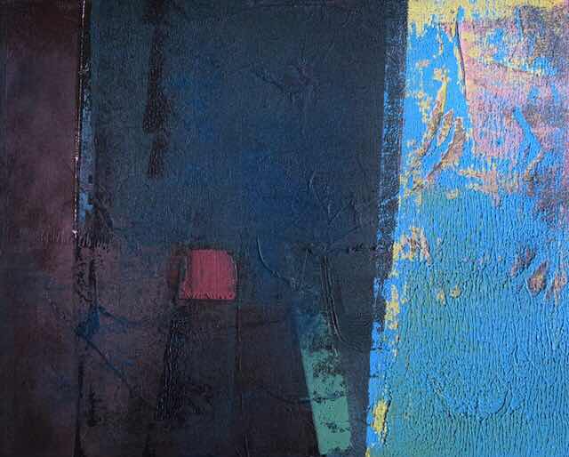
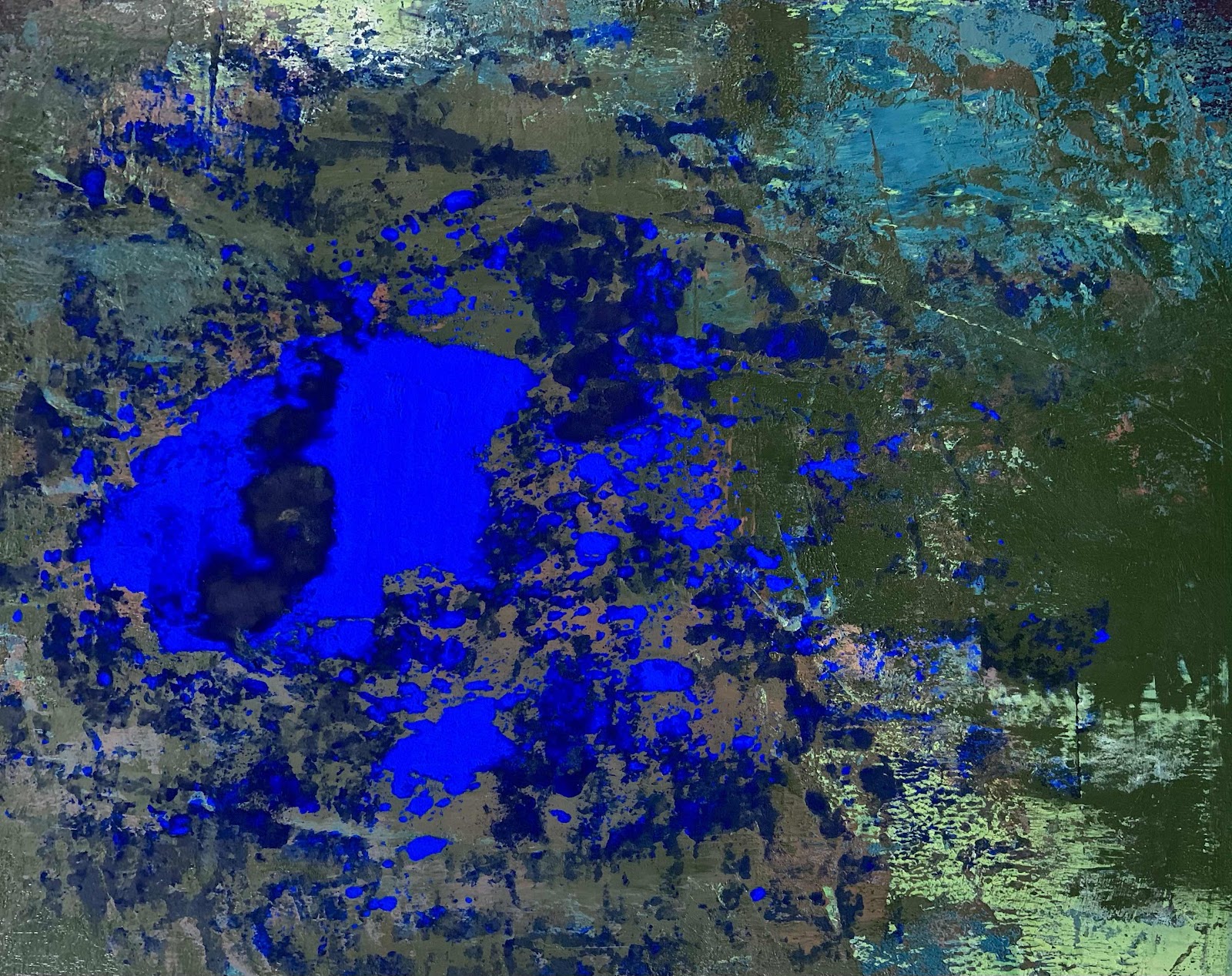


'Shining'

Oils and cold wax medium on 20 x 20 inch canvas.


That's all for now,
thank you for visiting.


To see more of my work,
click on the link below.


Thursday 21 January 2021

Moving and removing.


Conceal and reveal.


My job in the studio is to move paint around.
That's it.

Simply put of course but it really is the truth.


Layers of oils are placed on canvas, panel or paper.

'I conceal and by scraping or scratching I reveal'.

Below is an example of my work.
This is a new piece and drying on the table.

I like the simplicity of the marks and shapes
with soft, subtle greys and violet blues.

When dry I shall place it in a float frame.


Here is the canvas during part of the working process.
Several layers of paint are allowed to set up a bit before continuing.


I applied a mix of lighter paint with a brayer.
Then more blue/grey oils.

Scraping with a knife, I revealed the darker colours.
Paint was pulled down with a squeegee.

The painting can be viewed in all aspects...


I am always happy when this happens,
it's a sign of balance and harmony.


Below is my finished painting  


'Lightness of Being'

Oils and cold wax medium on 12 x 12 inch canvas.


That's all for now,
thank you for visiting.


If you would like to read more,
please click on the link below for my website.

Some of my paintings are available to buy.


Wednesday 13 January 2021

Removals.


Removing unwanted stuff..

These two patches of light green paint 
were on a recent painting in my studio.


Over the years I have become accustomed 
to making changes in my work and I am not afraid of the task.
If it goes wrong it isn't life threatening, it's paint.


I find it useful to leave a troublesome part
until another day as the 'first encounter'
when I walk into my studio will often highlight unwanted parts.


This was true today.
In my mind, the two patches here were giving 
the picture an unbalanced appearance.


The paint was still tacky so it was easy enough to scrape it away. 
   I also used my knife to scrape deeper 
and reveal the colours beneath.


Here is the new image...

Immediately the painting takes on a new perspective.
I like these random scratches.

Now the painting is balanced.


'Surfaces'


Oils and cold wax medium on a
12 x 16 inch cradled wood panel.
In an off-white wood float frame.


My painting evaluation went on...


This small canvas had similar treatment.
The patch of yellow oil paint was giving a disjointed effect.

I liked the painting and wanted to keep the general appearance,
so I carefully rolled out the paint with a brayer.


Some scraping revealed the pink beneath and
a few fine lines and scribbles scratched into 
the yellow finished off my design.

It can rest now and dry.


'In the moment'


Oils and cold wax medium on 12 x 12 inch canvas 

I have placed the painting in a wood float frame.


The picture can be viewed like this...


It gives a totally different aspect.
A friend suggested the colours reminded her
of the colours of tulips.


Finally...

Just a word about surfaces.
Using a wood panel means I can scrape 
back hard without damaging the surface.

On the other hand,
a canvas can get pierced easily if
there is too much rough treatment.  

I do like both supports,
it's really just a case of being aware and careful.   


That's all for now.
Until next time.


Tuesday 12 January 2021

Tulip time


In the pink...


'In the moment'

Oils and cold wax medium on 12 x 12 inch canvas 


My friend suggested the colours in
my painting remind her of tulips.

I am not a floral painter but I can accept this.
I love tulips and have planted new bulbs this year.

The painting began well, then turned into a green nightmare.
Scrape down after scrape it stayed in an ugly place.
I thought I was stuck with a sea of green.

Today I mixed some magenta with a little yellow pigment 
and added this to the top of my green base with 
a second layer of pink/red to brighten.
I scraped back some red to reveal the base.
My painting was looking better.

I had a video call from my 8 year old granddaughter 
and showed her my work.  She liked the pink.
Feeling more positive I continued...

I mixed some lemon yellow pigment powder 
with Liquin medium and a little smudge of magenta.
I added a good squeeze of Titanium white with some 
cold wax and made a pile of blush cream.

The loaded palette knife was spread swiftly 
across leaving a raised textured mark.
  It was tempting to smooth it out but I resisted the urge.
Just a diagonal score through 'anchored' the mark.


As I had a pile of paint left
 I decided to change a previous piece.
The painting was dry so any paint applied 
would not become muddied as a result.


Here is the earlier image...


I turned the panel round to make a fresh start.


Using the same pinks I smoothed some on one side.
Then I picked up the creamy yellow on a roller
and pressed it down onto the panel.

A thicker piece of yellow was smoothed onto the bottom left.
 Then a small roll pulling the oils down made a bit of ridged texture.

I decided to leave it at this point.  
Any further meddling could set me back.

I took photos of the two paintings and 
sent them to my granddaughter.


'Find the answer'

Oils and cold wax medium on 16 x 16 inch cradled panel 


That's all for now,
thank you for visiting.


Anne Wood - Paintings


Monday 11 January 2021

The trouble with abstraction.


Battleground.

There is a battle in my mind as I paint.


Time after time I struggle with my work and my
desire to make something which doesn't 
resemble a landscape or seascape.


Let me make it clear..
I have no dislike of landscapes,
I have painted hundreds over the last 20 years.

But...
I do not want to paint them today.

The painting below is a good example of my dilemma.


There are colours and shapes.
I wanted the picture to be about that.

Then my brain began to 'see' things...
A dark sky, twinkling lights in the distance,
water and reflections.

Despite the vertical format, my abstract painting had 
morphed into something resembling a seascape.

Trying to make sense of it...

I think the problem lies in splitting the canvas into 
sections, foreground, middle and distance.

This is how I view the world around me
so it is natural to 'see' this in the painting composition.

Today I turned the painting round
and viewed it another way...

Strangely, this traditional landscape format
made me look at the work differently.

In my mind I have regained my non-representation image.

I can now appreciate the difference in dark and light,
concentrate on the shapes, textures 
and colours purely for themselves.


 The Dutch painter and writer Theo van Doesburg 

wanted to escape all influences of 

naturalistic or figurative references.


He wrote the following...


"The painting must be entirely built up with 

purely plastic elements, namely surfaces and colours.


A pictorial element does not have any meaning beyond itself;

as a consequence, a painting does not have any meaning other than itself" 


Theo van Doesburg, co-author of the 

Concrete Art Manifesto 1930


My own battle will no doubt continue

as I try to disconnect from reality

and reach absolute clarity in abstract art.

I shall persevere.


Until next time,
thank you for visiting.


Tuesday 5 January 2021

Continuing my four aspects.


Balancing on the edge...


'The Dark Side'

Oils and cold wax medium on 20 x 16 inch canvas.


Yesterday I spoke about Balance.
This painting can also be viewed four ways.

I cannot remember how the piece began as
there are several paintings in progress.

Also, I am not good at keeping sketches or notes whilst I work.


Here is a group of canvases currently being worked.

The palette is Burnt Sienna, Ultramarine blue 
and Phthalo Blue red shade.

Three 12x12 inch canvases on the right...

Sienna and Ultramarine make a lovely rich 'black'.
This was rolled randomly onto the three supports.

I left white canvas bare for further ideas.
They are drying on the floor.

Floor painting is good as it gives me immediate access all round.
My tables are full of part worked pieces.


Something entirely different...


Just for fun this gorgeous Ultramarine Blue oil pigment powder 
was shaken onto some cold wax and rolled with a brayer.

I took a photograph for reference because this is temporary.
Fixing the powder will darken the pigment 
taking away this magical effect.


Here is another one.
Both are on Ampersand cradled panels.

This one began life as this...


I wanted to take it away from a landscape, so it had to change.   


It might have to move on some more.
It needs to dry a little to stop the mud effect.


That's all for now,
until next time.

Thank you for visiting.


Monday 4 January 2021

A long journey.


Getting there...


Balance is something I like to have
in my paintings.  It is really satisfying to
turn the canvas around to see if it works.

Eventually I have to decide 
which aspect to use for display.


Tonal values are important too.
They give the painting impact.


Changing the image to black and white 
is a useful exercise for checking this.


Three main values are evident here,
along with a few more subtle changes.


I like this monochrome effect.


The initial layers of paint...

Yellow, turquoise, white and blue.
Scraping back revealed the colours.


The canvas was left overnight to 'set up'.
At this point I wasn't sure where to go next.

It was too much like a landscape.
I wanted to take it further.


Using a rectangular canvas is a challenge 
when aiming for a non-objective image.

The mind seems to automatically visualise 
foreground, middle and distance, particularly 
when drawing marks across like the ones above.


A new day, a fresh start...


Coming back to the painting I intended
keeping to the green/blue palette.

As you see, that didn't happen.
Eventually I arrived at a conclusion.


Now for the hard part...the title.


That's all for now,
thank you for visiting.