Spoilt for choice...
A world of colour sits in my paint trolley.
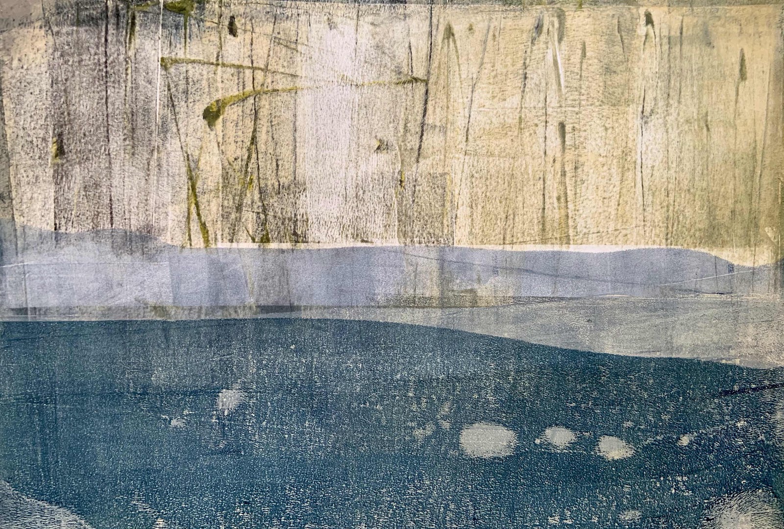
'Reeds'
The choice is entirely mine,
there are no rules.
It is a personal thing.
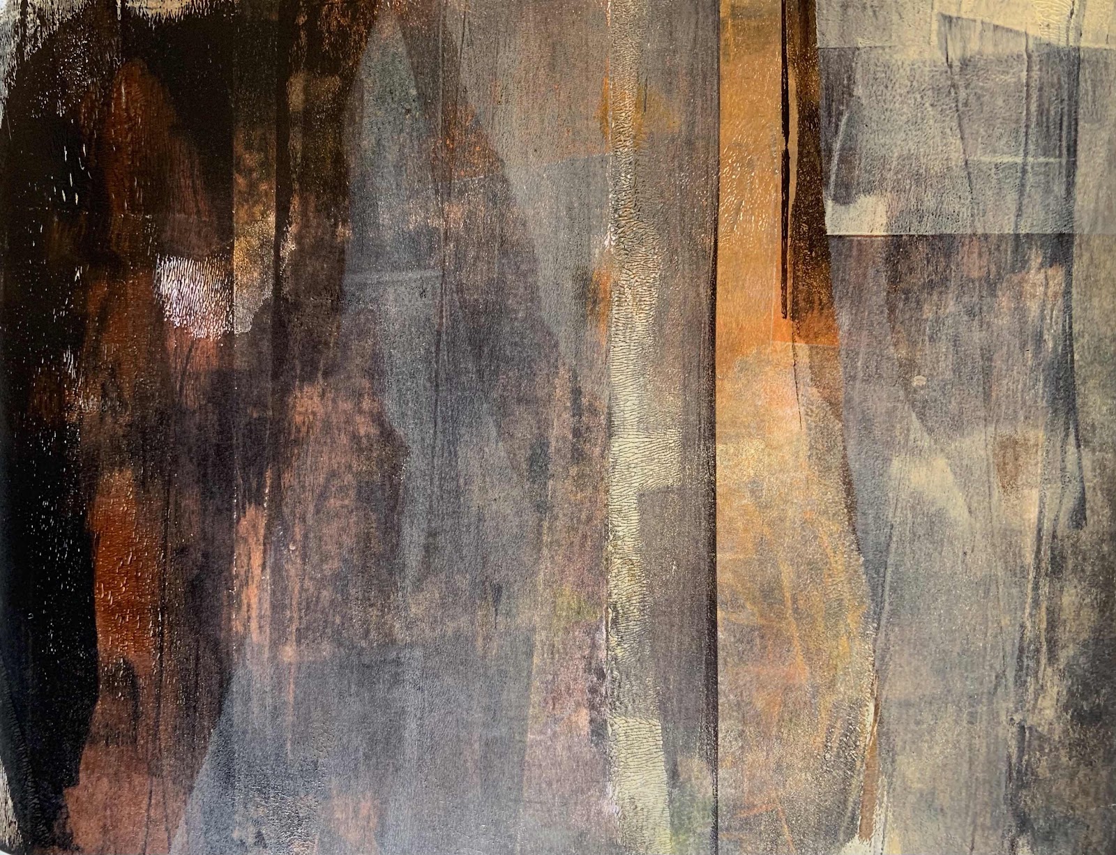
'Reach'
I love bright colour but I have noticed
that some colour combinations
look better for my monotype prints.
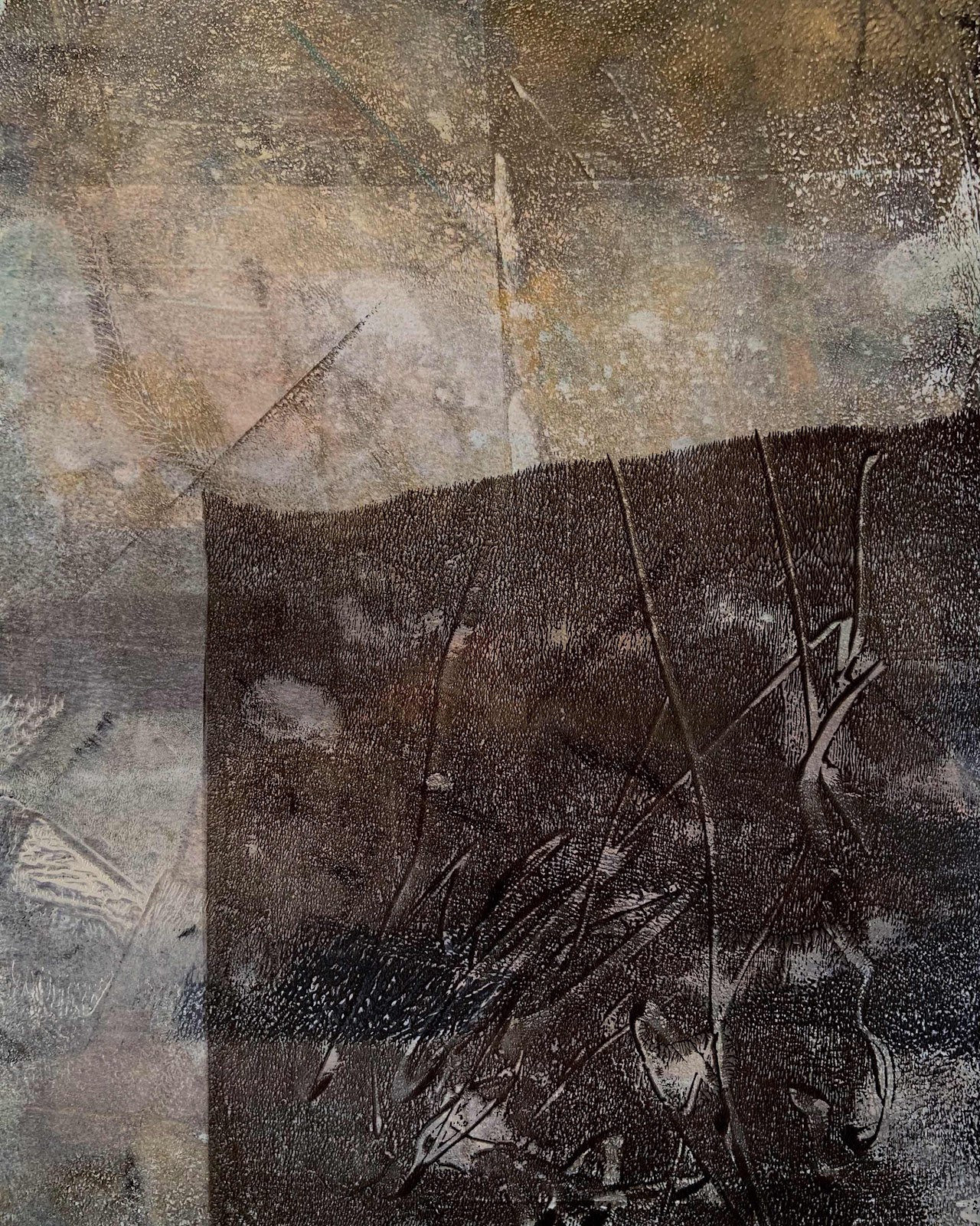
'Shadow'
Neutral colours seem happy in the off-white
mount mat and simple black frame.
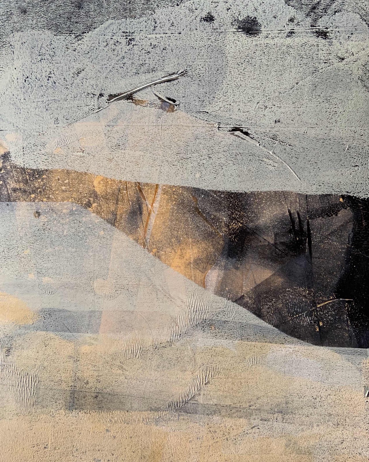
'Gap'
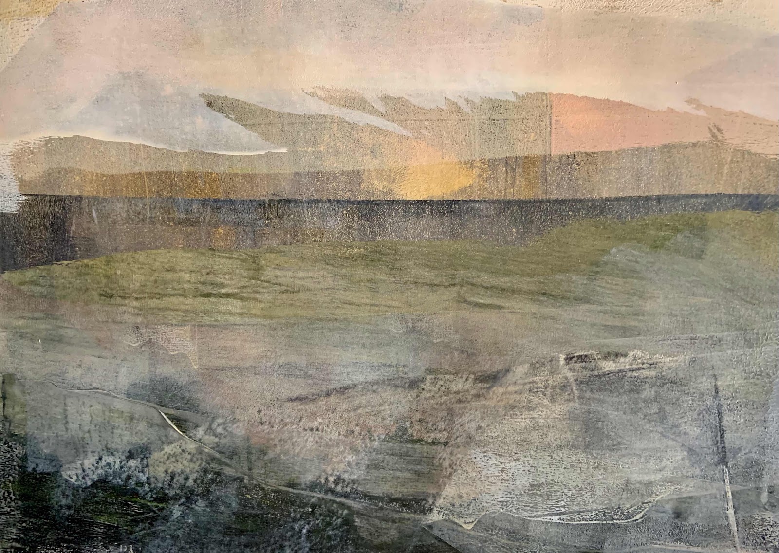
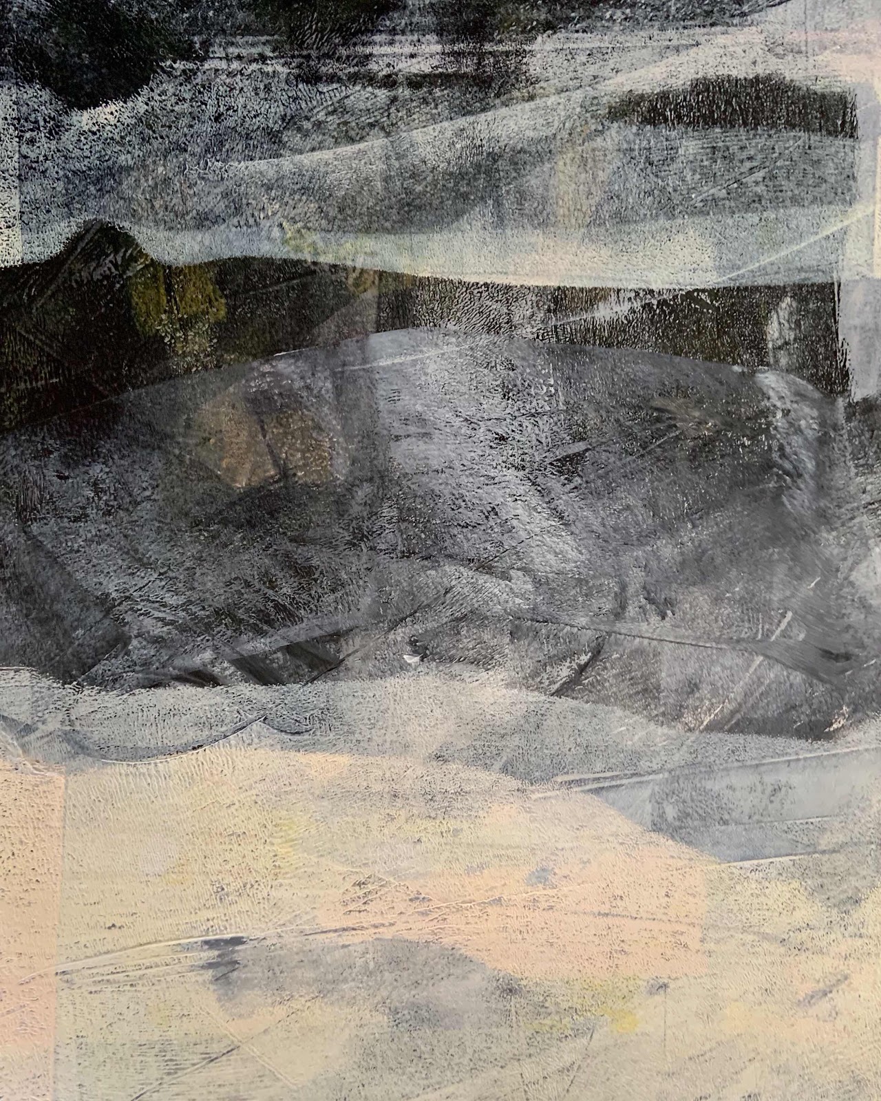
I like the sense of mystery about these prints.
Many are like abstract landscapes.
Some are purely shapes and marks,
lines and scratches but they tell a 'story'.
'Dawn'
It seems incredible that only a few weeks ago
this adventure with printmaking was just starting
whilst taking a break from my oil painting.
After some trials with different inks and paint
I settled with Golden Open Acrylics.
My favourite paper is smooth white 200-300gsm.
'Season'
The slower drying of Golden Open is helpful
when pulling the print from a gel plate.
I have time to manipulate the paint and paper.
I think my printmaking will continue.
That's all for now.
Thank you for visiting...

No comments:
Post a Comment